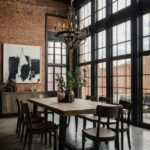
A kitchen filled with vibrant colors can instantly lift your mood and create a fun, inviting atmosphere. Imagine walking into a space where bright hues, playful patterns, and striking accents come together to create a kitchen that feels lively and energizing. By introducing bold cabinets, colorful backsplashes, or even vivid kitchen accessories, you can transform your space into a joyful hub that inspires creativity in your cooking.
This selection of 23 colorful kitchen designs is packed with ideas to help you explore the endless possibilities of incorporating color into your culinary space. Mixing different shades and tones can add personality and flair to your kitchen, making it a place where creativity thrives, and cooking becomes a delight.
Get inspired by these colorful kitchen ideas and see how you can bring fresh energy and a touch of fun into your home. Let the vibrant designs spark your imagination as you create a unique, cheerful kitchen that reflects your personal style!
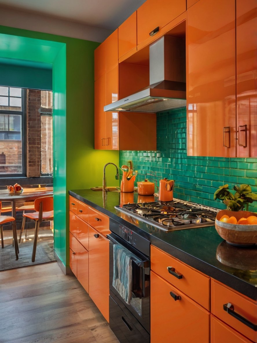
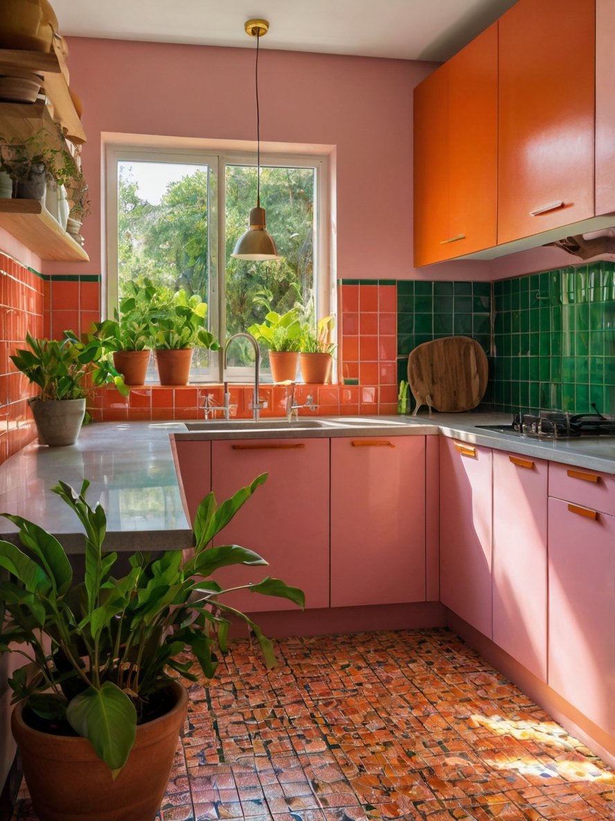
1. Creative Use of Tiles
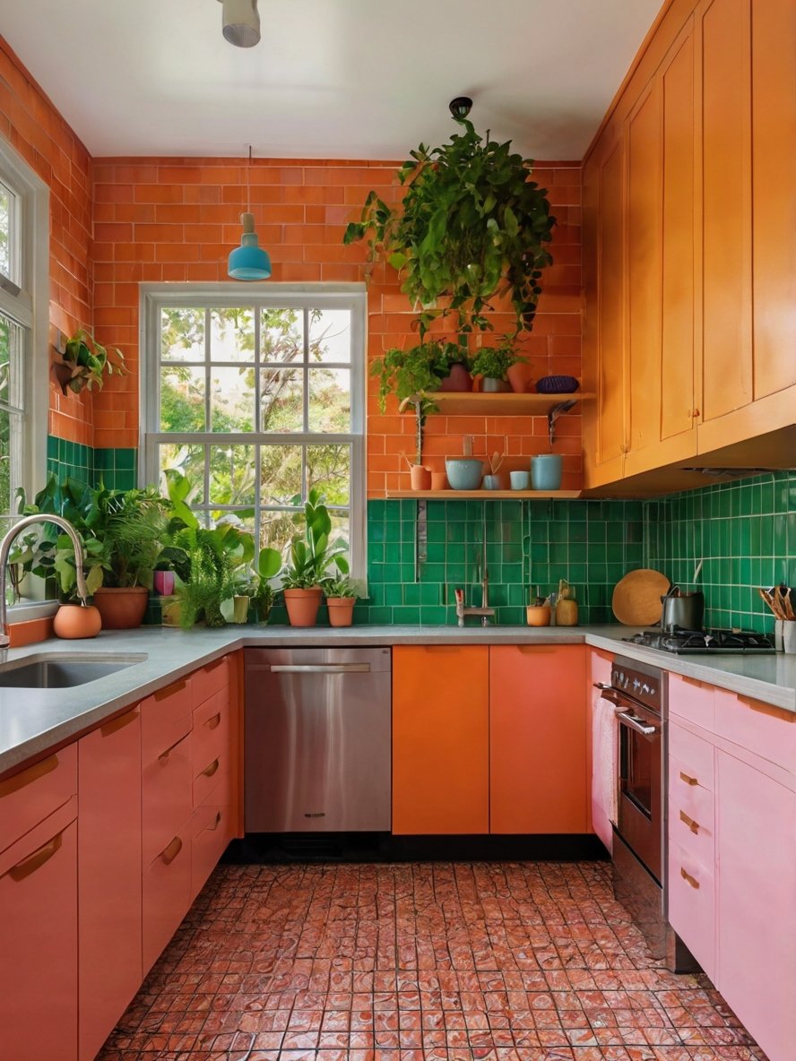
The combination of different tile styles and colors adds depth and texture to this kitchen. The upper walls feature glossy orange subway tiles, while the backsplash is made of striking emerald green tiles. These choices give the kitchen a layered look, with a rich visual complexity that feels dynamic rather than overwhelming. The floor tiles also contribute to the overall effect, showcasing an intricate pattern in a warm, earthy hue that ties into the overall scheme. This blend of textures not only enhances the dopamine effect but also adds a handcrafted, artisanal feel to the space. The high-gloss finish of the tiles further helps reflect natural light, making the kitchen appear even brighter.
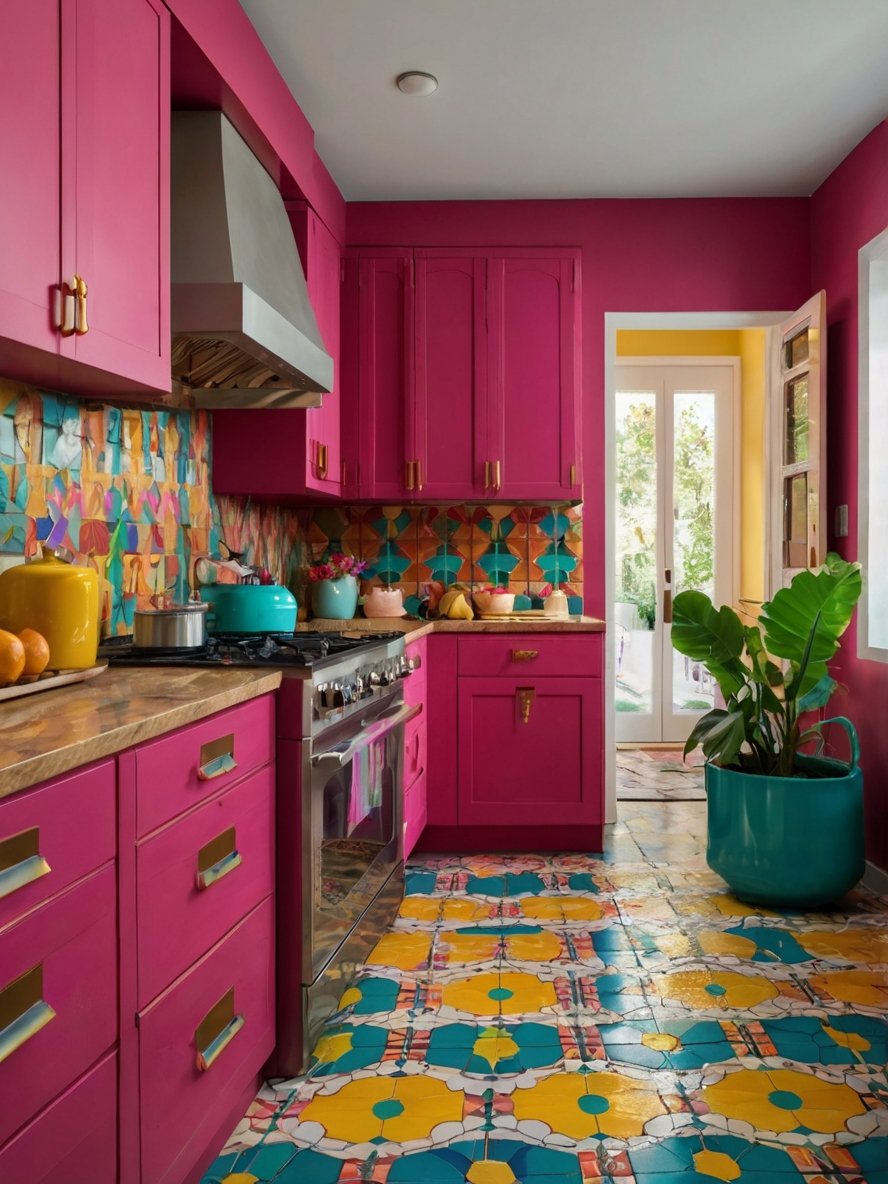
2. Playful and Artful Tilework
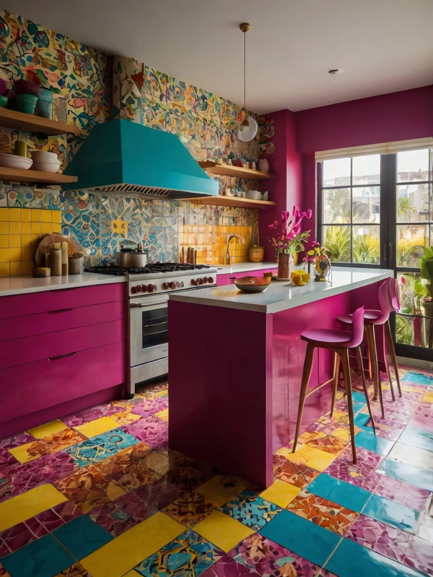
One of the most eye-catching elements of this kitchen is the stunning tilework. The floor features a patchwork of colorful tiles in magenta, yellow, blue, and marbled textures, creating a high-energy foundation for the space. Meanwhile, the backsplash tiles showcase an intricate, hand-painted style with organic shapes and floral motifs, reminiscent of traditional Mexican Talavera or Mediterranean designs. The mix of glossy and matte finishes adds depth and texture, making the kitchen feel layered and engaging. This fearless use of pattern not only adds artistic charm but also enhances the dopamine effect, making the space feel uplifting and inspiring.
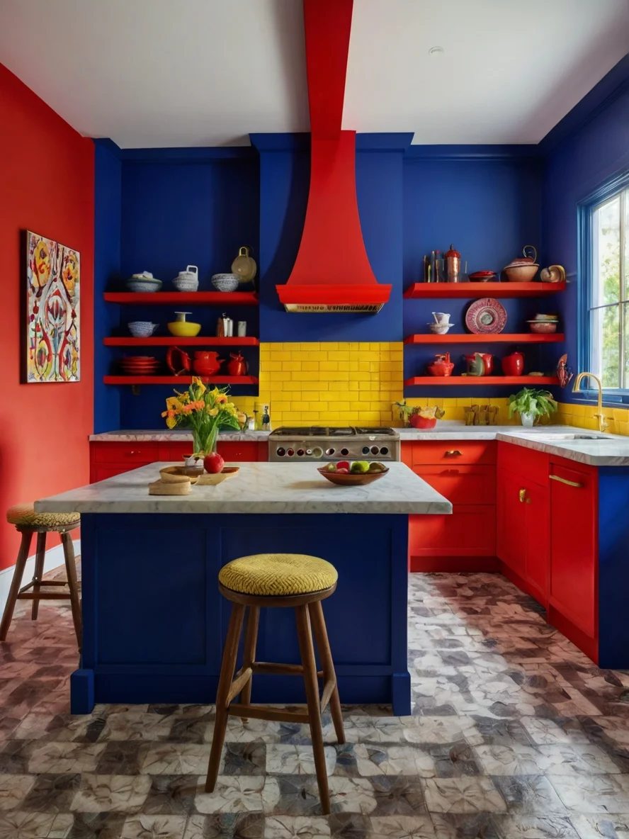
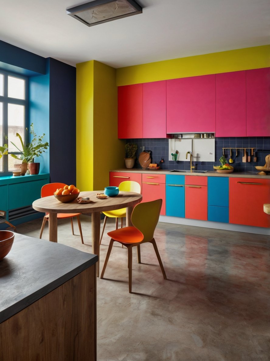
3. A Bold Primary Color Scheme
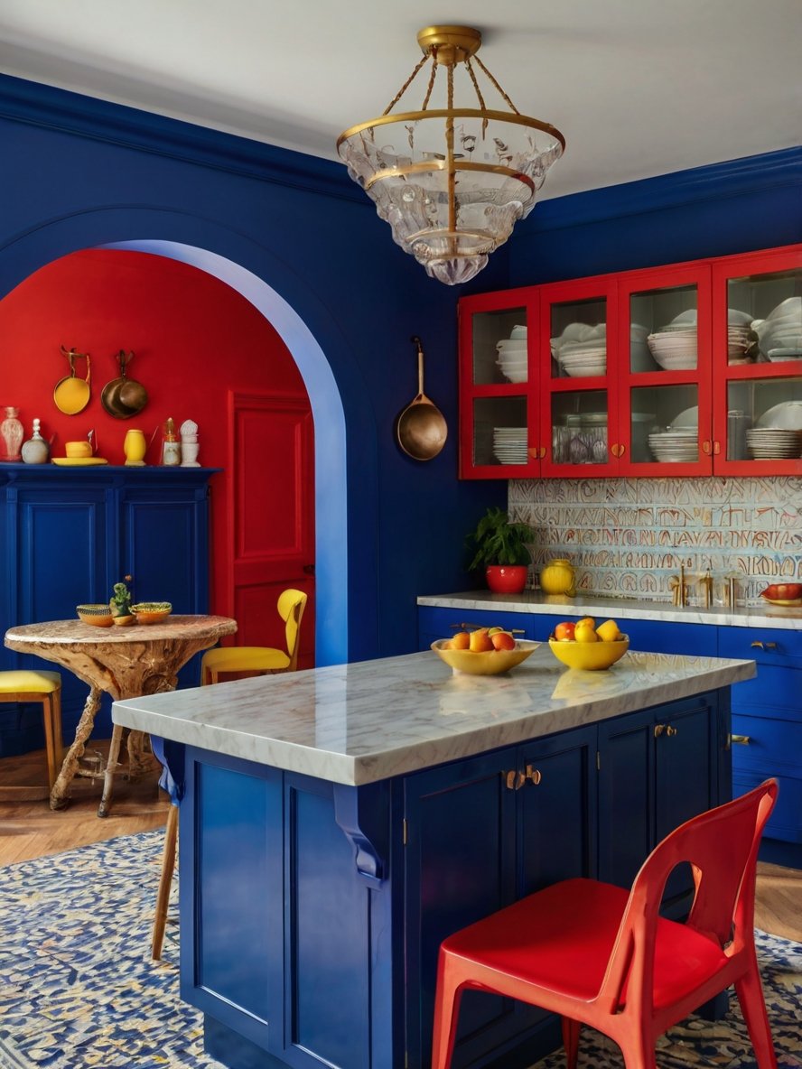
This kitchen is a masterclass in bold color blocking, featuring a striking mix of deep royal blue, fiery red, and sunshine yellow. The high-contrast palette evokes a sense of energy and playfulness, perfectly in tune with dopamine decor principles. The dominance of blue grounds the space, while the red accents add warmth and drama. Yellow highlights provide an unexpected burst of cheerfulness, preventing the design from feeling too intense. This primary color scheme is daring yet balanced, making the kitchen feel both sophisticated and dynamic. The strong color choices create a space that feels full of life, instantly lifting the mood and encouraging creativity.
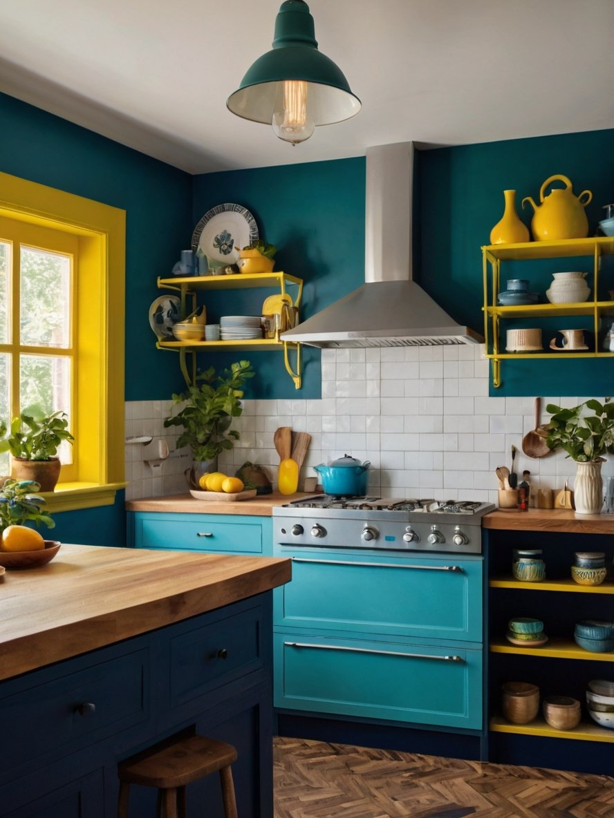
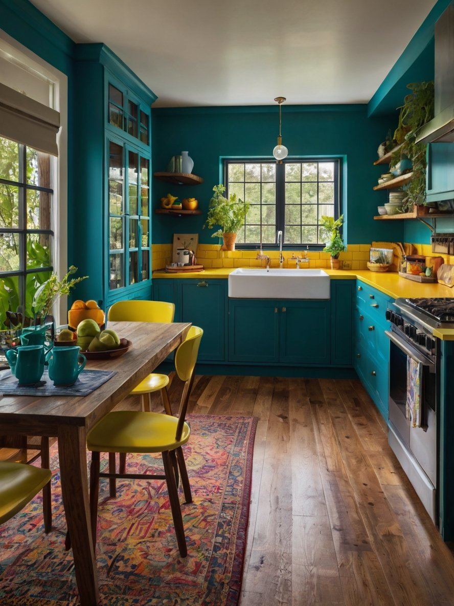
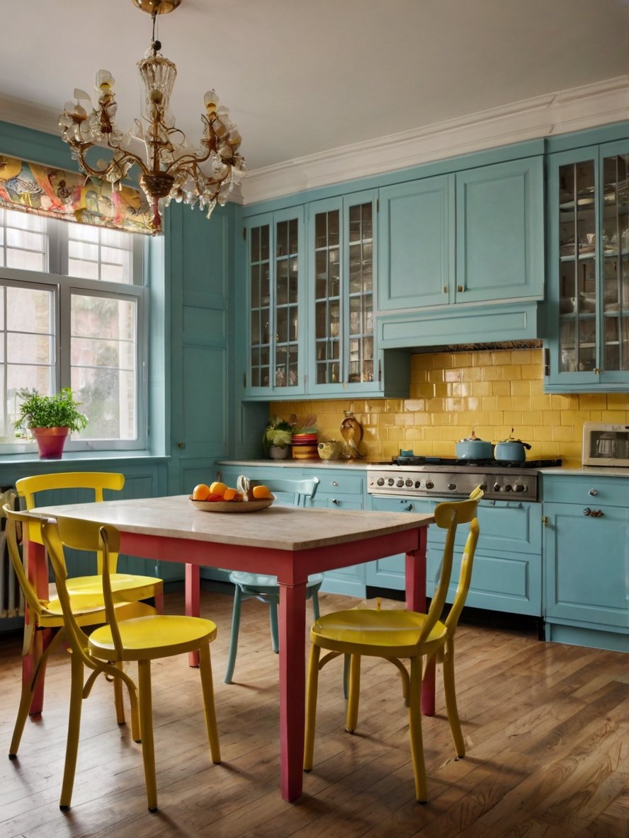
4. Deep Teal & Mustard Yellow Color
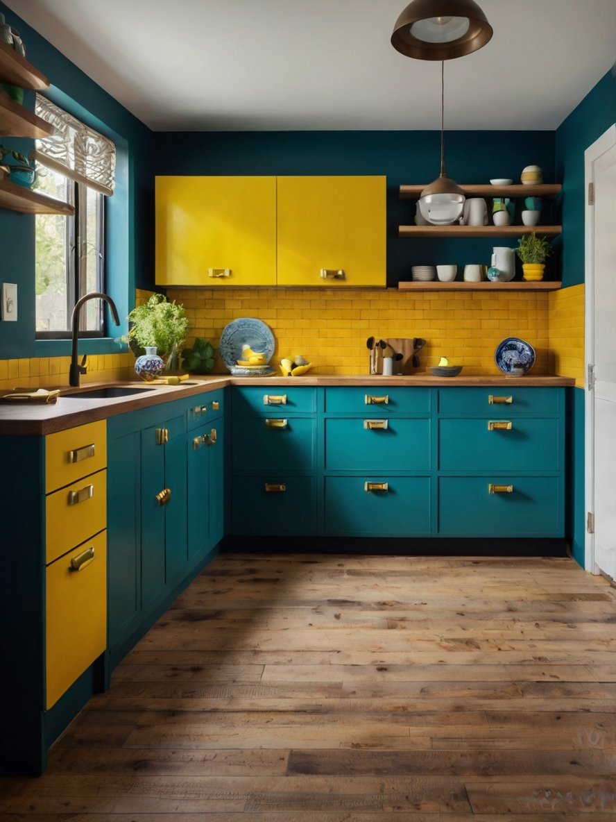
The most eye-catching aspect of this kitchen is its fearless use of color. The deep teal lower cabinets provide a rich, moody foundation, while the mustard yellow upper cabinets and backsplash introduce a bright and cheerful contrast. This combination is both unexpected and dynamic, creating an uplifting and visually engaging atmosphere. The interplay of cool and warm tones keeps the space balanced—teal adds depth and sophistication, while yellow injects a sense of energy and optimism. This kitchen perfectly embodies the dopamine decor trend by using color to create a space that sparks joy and creativity.
5. Glossy Surfaces
The kitchen’s sleek, high-gloss cabinetry gives it a modern and polished aesthetic. This reflective surface not only enhances the color intensity but also helps bounce light around the room, making the space appear larger and more luminous. The glossy finish also adds a tactile contrast to the rougher texture of the backsplash tiles and matte countertop. While high-gloss finishes can sometimes be prone to fingerprints, they contribute to the dopamine decor effect by making colors appear more saturated and vibrant. The shine adds a touch of glamour, proving that dopamine kitchens can be both fun and sophisticated.
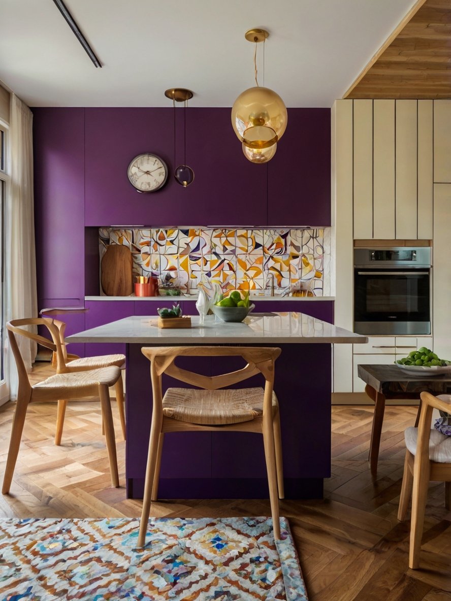
6. A Rich and Sophisticated Color Palette
The deep purple walls and cabinetry give this kitchen an opulent and dramatic feel. Purple is often associated with creativity and luxury, making it a perfect choice for a dopamine-inspired kitchen. The bold hue is balanced by soft cream cabinetry and a light-toned kitchen island, preventing the space from feeling too dark or overwhelming. The contrast between the deep purple and neutral tones creates a sophisticated and inviting atmosphere, proving that dopamine decor doesn’t always have to be bright—sometimes, rich and moody hues can be just as impactful.
7. A Multicolored Backsplash
The kitchen’s backsplash is a stunning mosaic of rounded square tiles in pastel blues, yellows, pinks, and oranges. The variation in color and shape creates a sense of movement, making the walls feel dynamic rather than static.
This tile choice is a perfect representation of dopamine decor—it’s playful, unconventional, and full of personality. The glossy finish of the tiles allows light to bounce around, enhancing the vibrancy of the colors.
Instead of a repetitive pattern, the backsplash tiles are arranged in an irregular color sequence, reinforcing the eclectic and artistic nature of the space. This type of design encourages creativity and spontaneity, making the kitchen feel less like a structured workspace and more like an artistic sanctuary.
8. Open Shelving for Display and Functionality
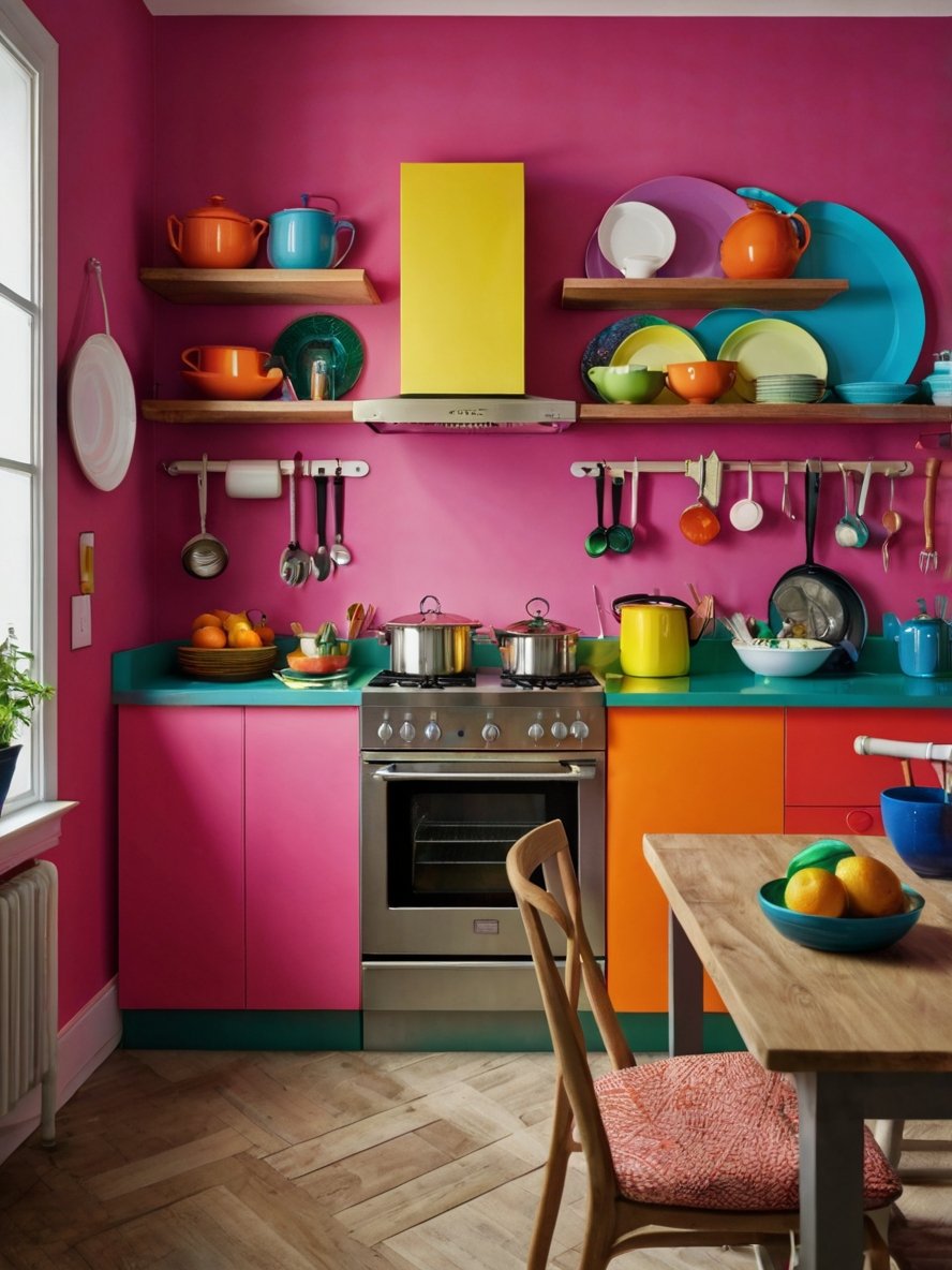
One of the standout features of this kitchen is the open wooden shelving, which replaces traditional upper cabinets. These floating shelves not only add to the sense of openness but also provide an opportunity for creative styling. Instead of hiding dishware and cookware behind cabinet doors, this design embraces an open and decorative approach, showcasing colorful dishes, bowls, and teapots as part of the aesthetic.
The carefully curated display of plates in shades of blue, yellow, and orange enhances the dopamine effect by introducing more color into the space. The arrangement is both functional and visually appealing, proving that everyday kitchen essentials can double as decor when styled thoughtfully. The use of natural wood shelves also adds warmth and texture, preventing the space from feeling overly artificial or plastic-heavy.
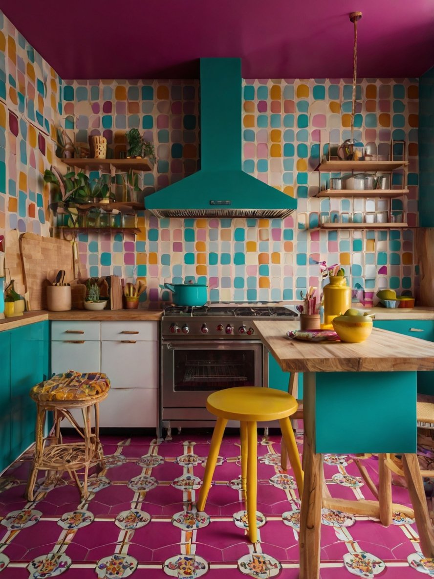
9. A Perfectly Balanced Blend of Energy and Calm
Ultimately, this kitchen succeeds in creating a space that is both high-energy and deeply calming. The bold interplay of pink, orange, and green stimulates creativity and joy, while the soft natural materials and biophilic elements ensure that the space remains soothing and welcoming.
The combination of dopamine-inspired color choices, artisanal tilework, natural wood, and lush greenery makes this kitchen a standout example of how color psychology and interior design can work together to create an emotionally uplifting space. It is a kitchen that invites creativity, encourages connection with nature, and sparks happiness every time you step into it.
10. Well-Balanced Combination of Modern and Vintage Influences
Despite its bold color choices, this kitchen maintains a balance between modern and vintage aesthetics. The rich blue cabinetry and sleek marble countertops introduce a sense of contemporary elegance, while the woven rattan stools, patterned tile flooring, and decorative ceramics add nostalgic, old-world charm.
This blend of styles creates a unique and timeless feel. The modern lines of the cabinetry and open shelving provide a clean, structured look, while the vintage-inspired details add warmth and character. This balance is a key feature of dopamine decor—ensuring that the space feels joyful and playful without sacrificing sophistication.
11. A Soft Yet Energizing Pastel Color
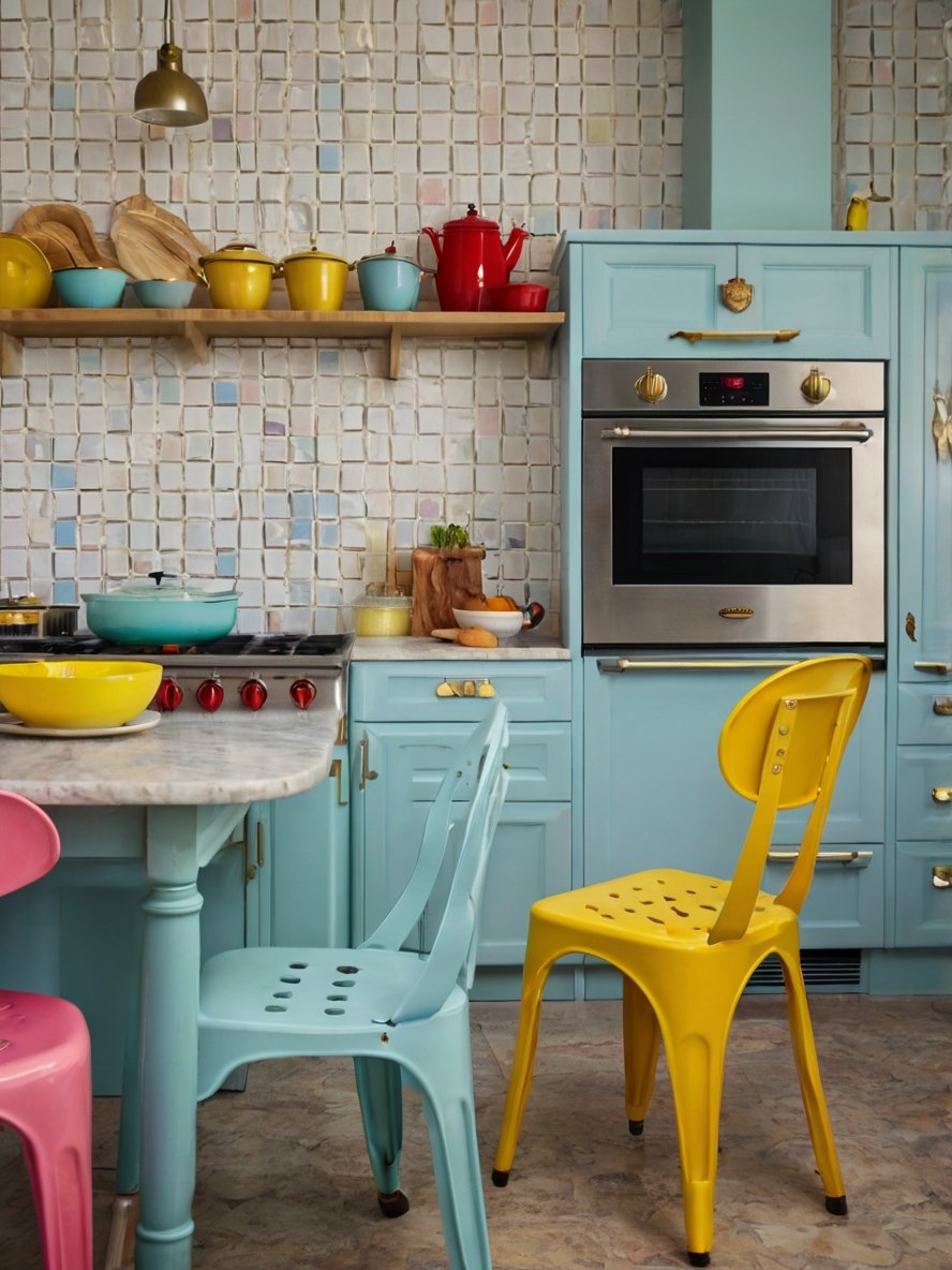
One of the most defining features of this kitchen is its dreamy pastel color scheme. The powder blue cabinetry serves as a soft and serene base, evoking a vintage aesthetic reminiscent of classic 1950s kitchens. This muted shade of blue adds a sense of calm and tranquility, making the kitchen feel airy and inviting.
However, rather than relying solely on pastels, this kitchen introduces bright pops of color to create a lively contrast. The yellow and red accents—from the chairs to the cookware—add vibrancy and energy, ensuring that the space remains dynamic. This interplay between pastels and bold hues follows the dopamine decor philosophy, which emphasizes joyful and unexpected color combinations that stimulate happiness.
The soft pastel tones also work beautifully with the neutral elements, such as the warm wooden shelving and the textured mosaic tile backsplash. This balance ensures that the space does not feel overly saturated but remains light, cheerful, and full of personality.
12. Retro-Modern Stools
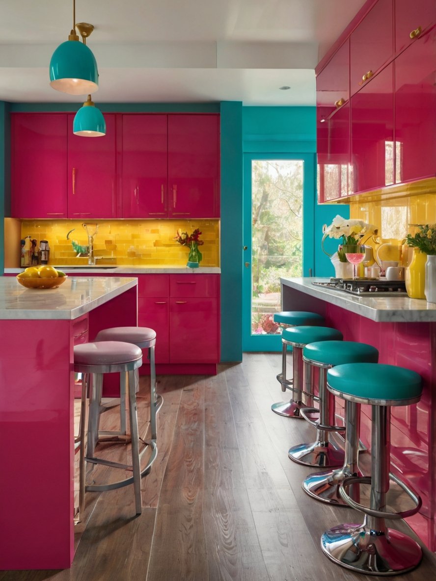
The sleek, chrome-based bar stools with turquoise cushions are one of the most distinctive elements of this kitchen. Their retro aesthetic, inspired by classic American diners, adds a nostalgic touch while still feeling contemporary.
The polished chrome finish ties into the high-gloss cabinetry, reinforcing the kitchen’s sleek and futuristic feel. The turquoise seats offer a refreshing contrast to the pink island, ensuring that the space feels dynamic rather than monochromatic. The circular footrests and sturdy bases make these stools not only stylish but also functional, offering a comfortable seating option for casual meals or social gatherings.
13. A Vintage-Inspired Green Oven
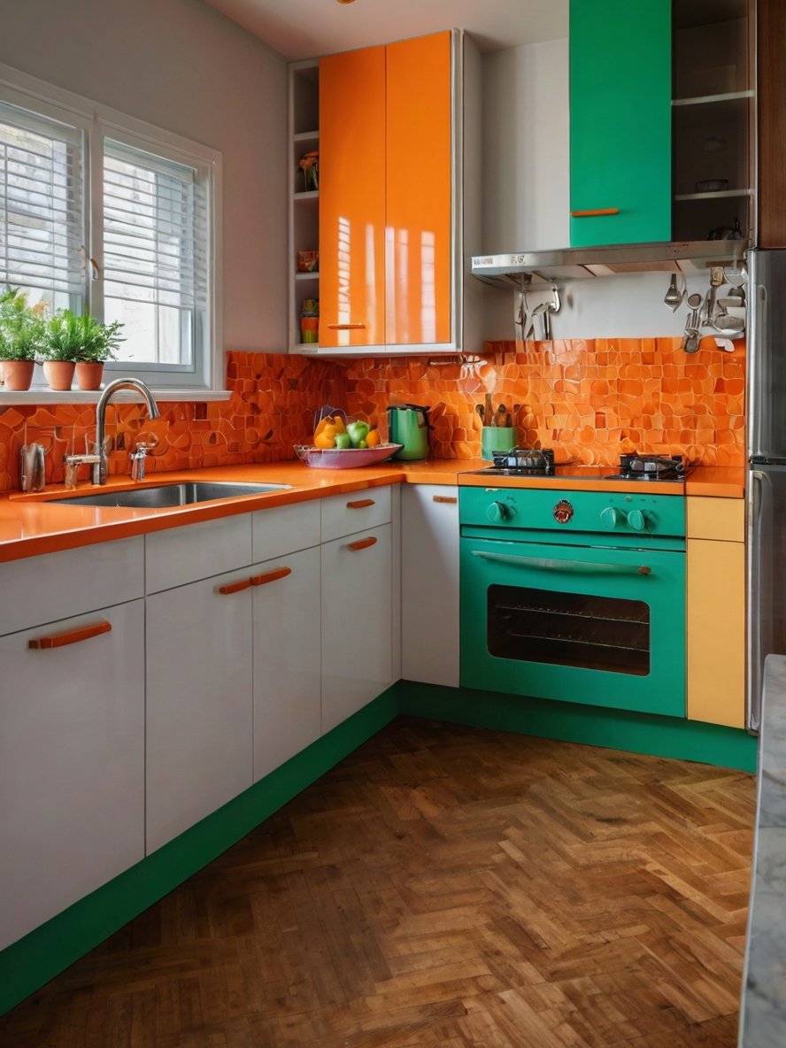
The green oven is a standout feature in this kitchen, adding a retro touch that complements the dopamine decor aesthetic. Its rounded edges and chrome accents evoke a nostalgic feel, reminiscent of classic mid-century kitchen designs.
This appliance choice reinforces the overall color scheme while providing a charming focal point that feels both functional and decorative. The contrast between the green oven and the surrounding orange countertops makes this area of the kitchen especially eye-catching, further enhancing the space’s playful and expressive nature.
14. A White Tiled Backsplash
The backsplash features white square tiles with slightly irregular edges, adding a subtle handcrafted feel to the kitchen. This choice is particularly effective in balancing the strong blue and yellow tones, preventing the space from feeling overly saturated.
The white tiles reflect light, helping to brighten the kitchen while also providing a clean, timeless contrast to the surrounding colors. The slightly uneven texture of the tiles adds depth, ensuring that the walls feel dynamic rather than flat. This blend of modern and artisanal elements keeps the kitchen feeling fresh while maintaining a sense of warmth.
15. A Fearless and High-Contrast Color
The standout feature of this kitchen is its fearless approach to color. Bright yellow, vivid pink, deep orange and bold turquoise come together in an exciting and unconventional mix that immediately stimulates the senses. The yellow cabinetry exudes warmth and optimism, while the pink and orange lower cabinets inject energy and passion. The turquoise walls provide a cool contrast, preventing the space from feeling too warm-heavy.
This color scheme follows the dopamine decor philosophy by using unexpected combinations to create a visually engaging and joyful atmosphere. Instead of blending in, every element stands out, making the kitchen a statement space that encourages creativity and positivity. The careful placement of colors ensures that while the design is bold, it never feels chaotic.
16. Warm Wood Flooring and Cool Metallics
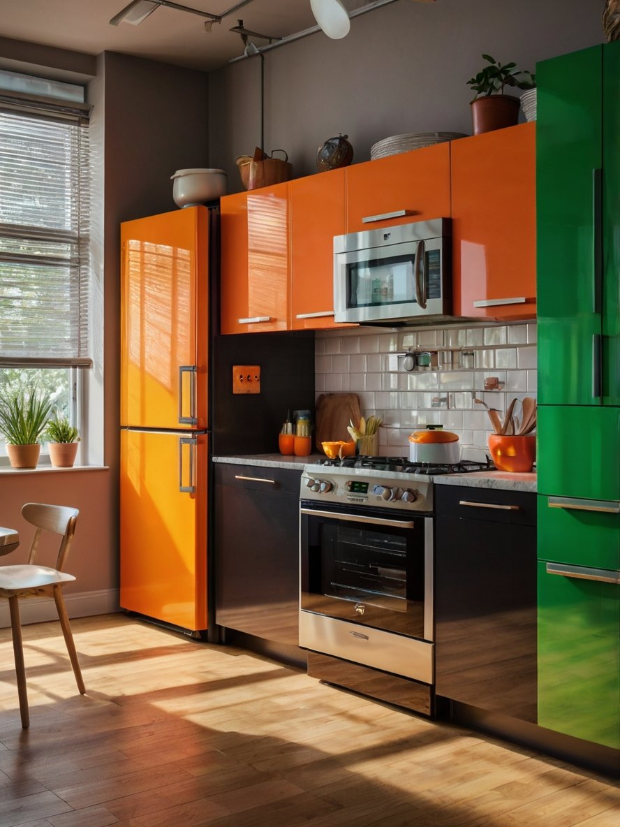
To balance the sleek, high-gloss cabinetry and industrial accents, the kitchen incorporates warm wood flooring, which adds an organic and grounding element. The natural wood grain softens the bold color contrasts, ensuring that the kitchen does not feel too sterile or artificial.
The flooring’s warm undertones complement the orange cabinetry, reinforcing a sense of coziness and warmth. This balance between bold colors, metallic surfaces, and natural materials aligns perfectly with dopamine decor principles, which emphasize a harmonious blend of energy and comfort.
17. Classic Cabinetry That Feels Timeless
The cabinetry in this kitchen is both a functional and aesthetic highlight. The deep teal cabinets have a classic design with recessed paneling, which adds dimension and elegance. Floor-to-ceiling cabinetry ensures ample storage while making the space feel grand and well-structured.
One particularly striking feature is the glass-paneled upper cabinets. Instead of heavy, solid doors, these glass panels introduce an element of transparency, allowing the display of curated dishware and decor. This breaks up the solid teal color and adds a touch of openness, preventing the kitchen from feeling enclosed.
The lower cabinets maintain a traditional, yet stylish appeal with gold or brass-toned hardware, reinforcing the jewel-toned elegance. The choice of brass adds warmth, complementing the yellow accents throughout the space.
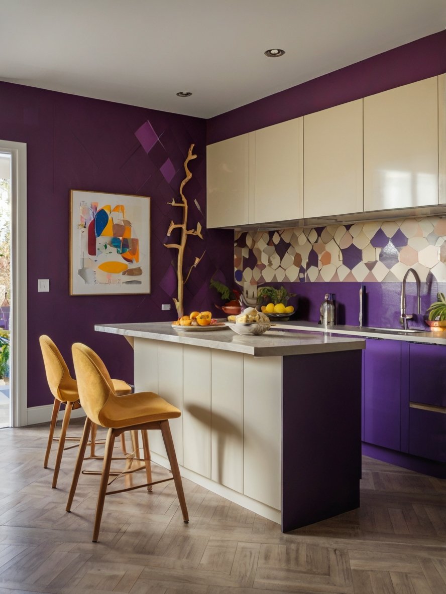
18. Luxurious Plum Color
The most striking element in this kitchen is the deep plum cabinetry, which instantly establishes a sense of luxury and individuality. Unlike traditional neutral kitchens, this space fully embraces a bold jewel tone that is both dramatic and sophisticated. The color choice is unexpected yet harmonious, making the kitchen feel like a refined, curated space rather than a standard cooking area.
Plum is a color associated with creativity, royalty, and depth, making it a perfect choice for dopamine decor. It adds warmth without overwhelming the space, ensuring that the kitchen remains inviting rather than intimidating. The matte finish of the cabinetry enhances the richness of the color, giving it a velvety texture that absorbs light beautifully, creating a sense of depth and luxury.
Unlike glossy finishes that reflect a lot of light, the matte plum cabinetry maintains a soft, understated elegance, ensuring that the space feels intimate and welcoming. This deliberate choice in finish contributes to the overall sense of balance in the kitchen, allowing the bold color to shine without feeling excessive.
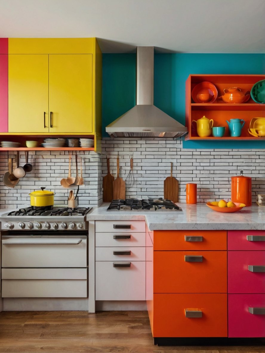
19. Sparks Happiness
This kitchen fully embraces color in the most fearless way possible. The cabinetry is a striking mix of fuchsia pink, sky blue, warm orange, and deep mustard yellow—each hue playing off the other to create a bold, high-energy environment. The unexpected combinations are what make this kitchen so dynamic and unique.
Instead of sticking to a single dominant color, the kitchen uses color blocking as its primary design language, giving each section of the space its own personality. The upper cabinets are primarily pink, drawing the eye upwards and creating a sense of height. The lower cabinets alternate between blue and orange, injecting a playful contrast that keeps the space from feeling too predictable. The mustard yellow accents at the top add another layer of vibrancy, ensuring that every surface feels intentional and engaging.
This color scheme is the perfect embodiment of dopamine decor, proving that kitchens don’t have to be neutral or traditional to feel sophisticated and stylish. It is a space designed for those who love creativity, spontaneity, and joyful self-expression.
20. Glass-Front Cabinets
The upper cabinets feature glass-paneled doors, a design choice that enhances the open and airy feel of the kitchen. Instead of solid cabinetry that might feel heavy or enclosed, these glass doors allow for a glimpse of neatly arranged dishware, further contributing to the curated dopamine aesthetic.
The transparency of the glass also plays with reflections, subtly expanding the perceived space while adding an element of layering. It prevents the pastel blue cabinetry from becoming too dominant by breaking up its solidity with moments of openness.
This design also encourages intentional styling—colorful dishes, glassware, and decorative elements can be displayed to enhance the dopamine effect, turning everyday objects into part of the decor.
21. A Vibrant Hot Pink Cabinetry
The boldest feature of this kitchen is undoubtedly the hot pink cabinetry, which dominates the space with unapologetic vibrancy. Unlike conventional neutral or subdued kitchens, this design choice fully embraces the dopamine decor philosophy of using color to evoke happiness and excitement.
Pink is an unconventional yet powerful choice for kitchen cabinetry, as it introduces warmth, femininity, and energy into the space. The shade chosen here is particularly striking—it is neither too soft nor too dark, maintaining a perfect balance of playfulness and sophistication. The matte finish ensures that the cabinets remain bold without appearing overly glossy or artificial.
Additionally, the cabinetry design features classic panel detailing, preventing it from feeling too modern or minimalist. This subtle touch adds depth and dimension, ensuring that the bold color doesn’t overwhelm the space. The gold-toned hardware further elevates the cabinetry, adding a luxurious element that contrasts beautifully with the pink hue.
22. Bold Color Blocking
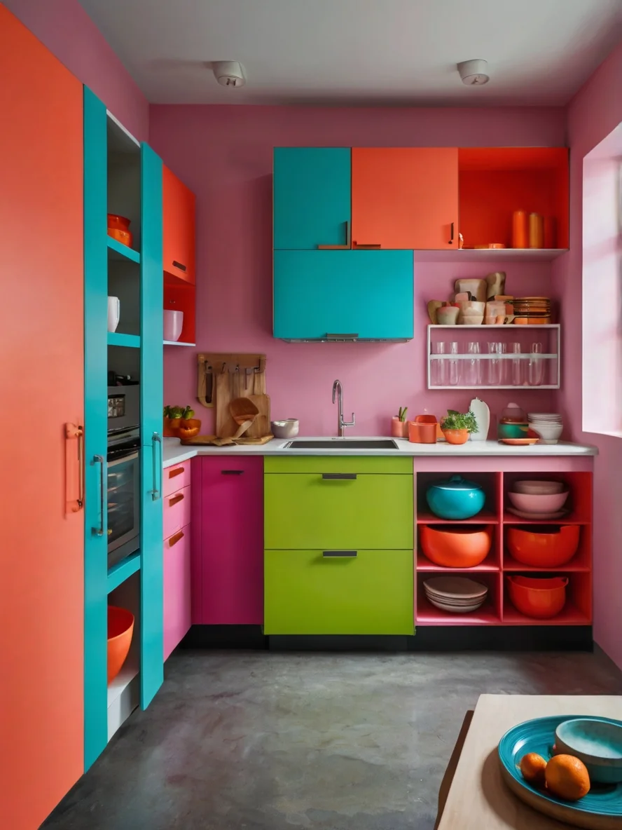
The first thing that stands out in this kitchen is the fearless use of color blocking. Instead of blending hues in a subtle gradient, the design features distinct, geometric sections of bright turquoise, coral orange, neon green, and pink. This sharp contrast creates a high-impact visual that instantly stimulates the senses and enhances the dopamine effect.
Color blocking in a kitchen is not just about aesthetics; it also helps create a sense of organization and hierarchy within the space. Each cabinet section feels like its own designated zone, making it easier to navigate the layout. The balance between warm and cool tones—orange and pink against blue and green—ensures that the space feels both vibrant and harmonious.
The use of matte finishes on the cabinetry prevents the colors from becoming too overwhelming, softening the overall look while maintaining their intensity.
23. An Intricate Hexagonal Backsplash
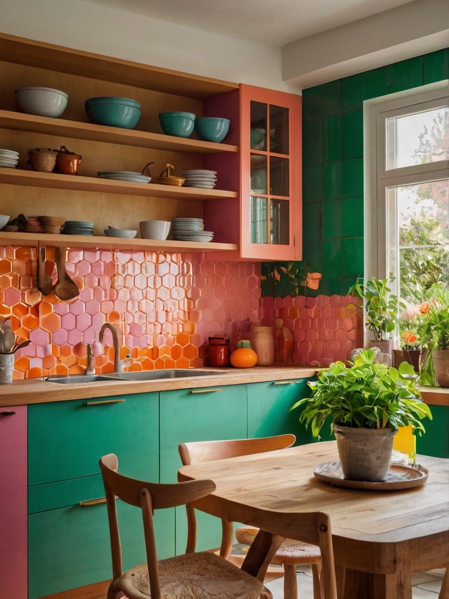
One of the standout design elements in this kitchen is the hexagonal tile backsplash, featuring a gradient of pink and orange hues. The honeycomb-like structure of the tiles adds an extra layer of dimension, creating a stunning interplay of light and shadow.
The glossy finish of the tiles enhances their vibrancy, reflecting natural light and making the space feel even more dynamic. The subtle shift in color between the pink and orange tiles creates a sense of movement, preventing the backsplash from feeling flat or monotonous.
This geometric design choice reinforces the dopamine effect by engaging the senses—not only through color but also through texture and pattern. The backsplash serves as both a functional and decorative feature, protecting the walls while acting as an artistic statement.
* We hope these ideas inspire you to add playful elements and bold hues to your own kitchen. Keep exploring creative ideas and find more ways to bring a fun, fresh twist to your kitchen design!