
Let’s be honest, picking the right living room color can feel like the ultimate “choose your destiny” moment. It sets the tone for your home, affects the mood of everyone walking in, and basically decides whether people think you have great taste or… need some Pinterest inspiration ASAP. But here’s the thing: color is personal.
What feels calm and cozy to one person might scream “boring” to another. So instead of giving you a bunch of generic advice, I’ve rounded up 25 living room color ideas that can completely transform your space.
Whether you want soft and serene, bold and energetic, or something in between, you’ll find a vibe that speaks to you. Let’s dive in, shall we?
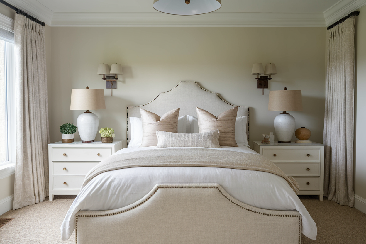
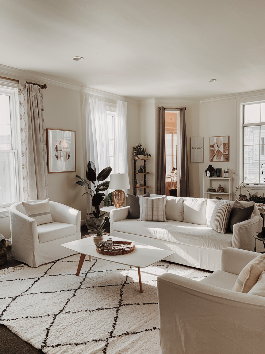
1. Soft Beige for Effortless Warmth

Beige has a bad reputation for being boring, but the right beige can make your living room feel instantly warm and inviting without being overpowering. Think creamy undertones, not dull khaki. This is the kind of color that plays nicely with everything—wood furniture, modern metallic accents, even that vintage armchair you cannot let go of. Add layered textures like linen throw pillows, a chunky knit blanket, and a woven rug to make the space feel rich and cozy. Bonus: beige walls also reflect light beautifully, which means your living room will feel brighter without you having to invest in extra lamps.
2. Deep Navy for Sophisticated Drama
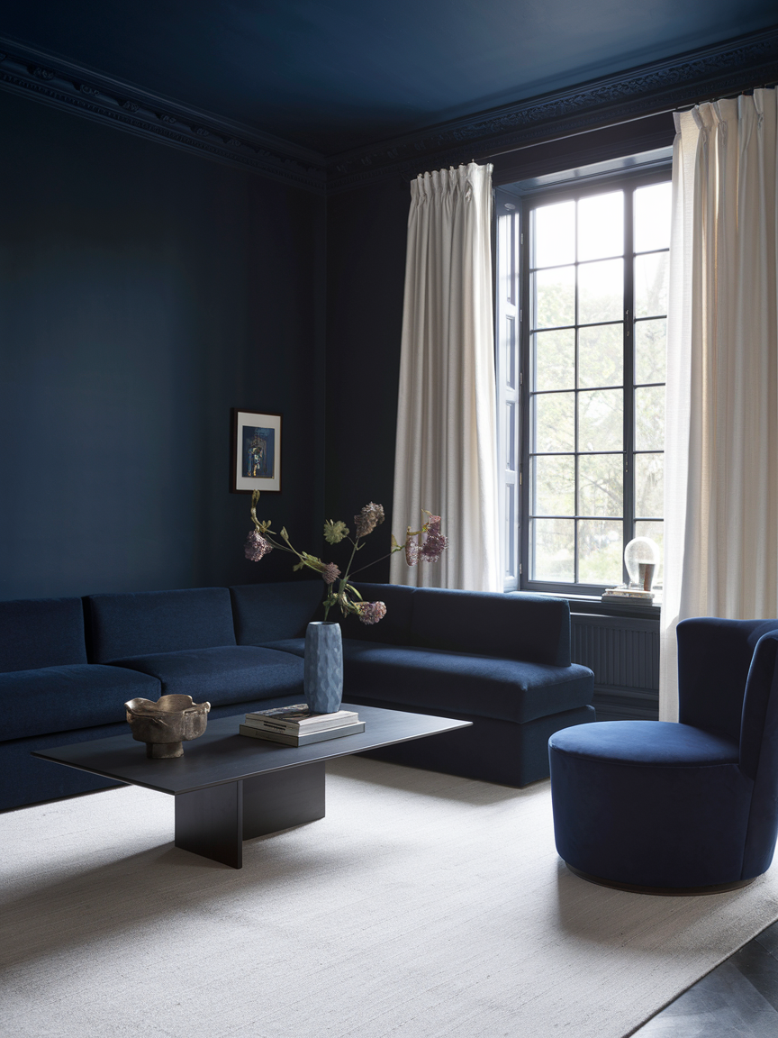
If you want your living room to look like it belongs in a luxury hotel, navy blue is your secret weapon. It’s rich, moody, and works wonders in making other colors pop—think gold accents, crisp white trim, or bold patterned cushions. Painting your walls navy instantly creates a cocoon-like feeling, perfect for cozy evenings or entertaining guests. Pro tip: pair it with warm wood furniture to balance the cool tones. It’s bold without feeling shouty, which is exactly the sweet spot you want for a stylish yet livable space.
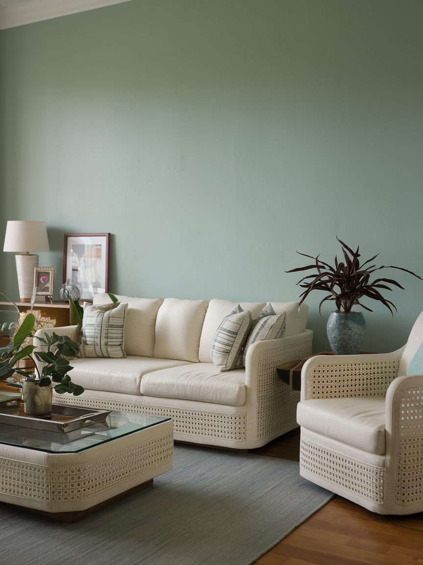
3. Sage Green for Natural Calm
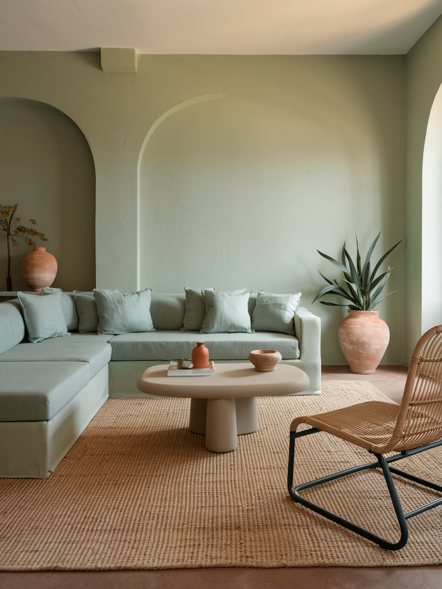
Sage green is like a deep breath for your living room. It’s soft, soothing, and makes you feel like you’re surrounded by nature, even if your “view” is just the neighbor’s brick wall. This color works beautifully with earthy materials like jute rugs, terracotta pots, and rattan chairs. Add some real or faux greenery to lean into the nature-inspired theme. The result? A calming retreat that feels organic and timeless, making it perfect for both lazy Sunday lounging and quiet evening reading sessions.
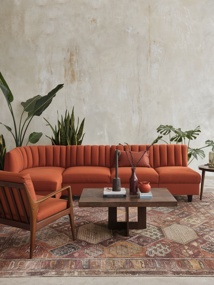
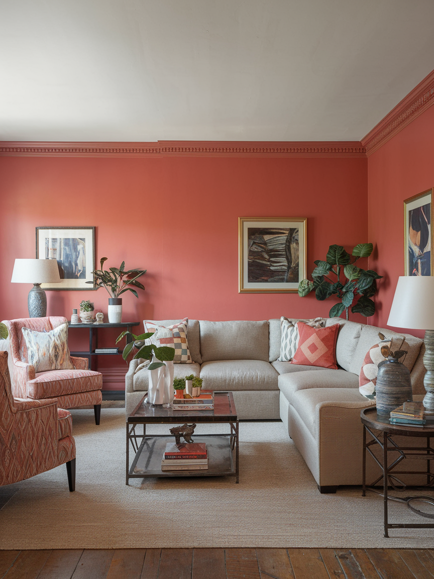
4. Warm Terracotta for Earthy Charm
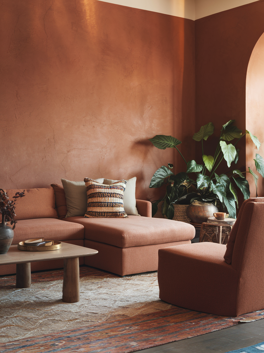
Terracotta isn’t just for pots, it’s a color that can make your living room glow with rustic warmth. This shade instantly adds depth and character, creating a grounded feel that works beautifully with bohemian or Mediterranean styles. Pair it with textured neutrals, dark woods, and perhaps a few patterned throw pillows for a cozy, layered look. The best part? It feels inviting all year round, making it one of the most versatile warm tones you can choose for your space.
5. Crisp White for Airy Freshness
White might sound like the “safe” choice, but when done right, it can feel like the boldest. Crisp white walls create a blank canvas that lets your furniture, art, and décor shine. The trick is to mix textures so it doesn’t feel sterile—think fluffy rugs, woven baskets, and cozy throws. This color reflects light beautifully, making your living room feel more spacious and open. Plus, it gives you the freedom to switch up your color scheme whenever you feel like it without repainting.
6. Classic Black for Chic Drama
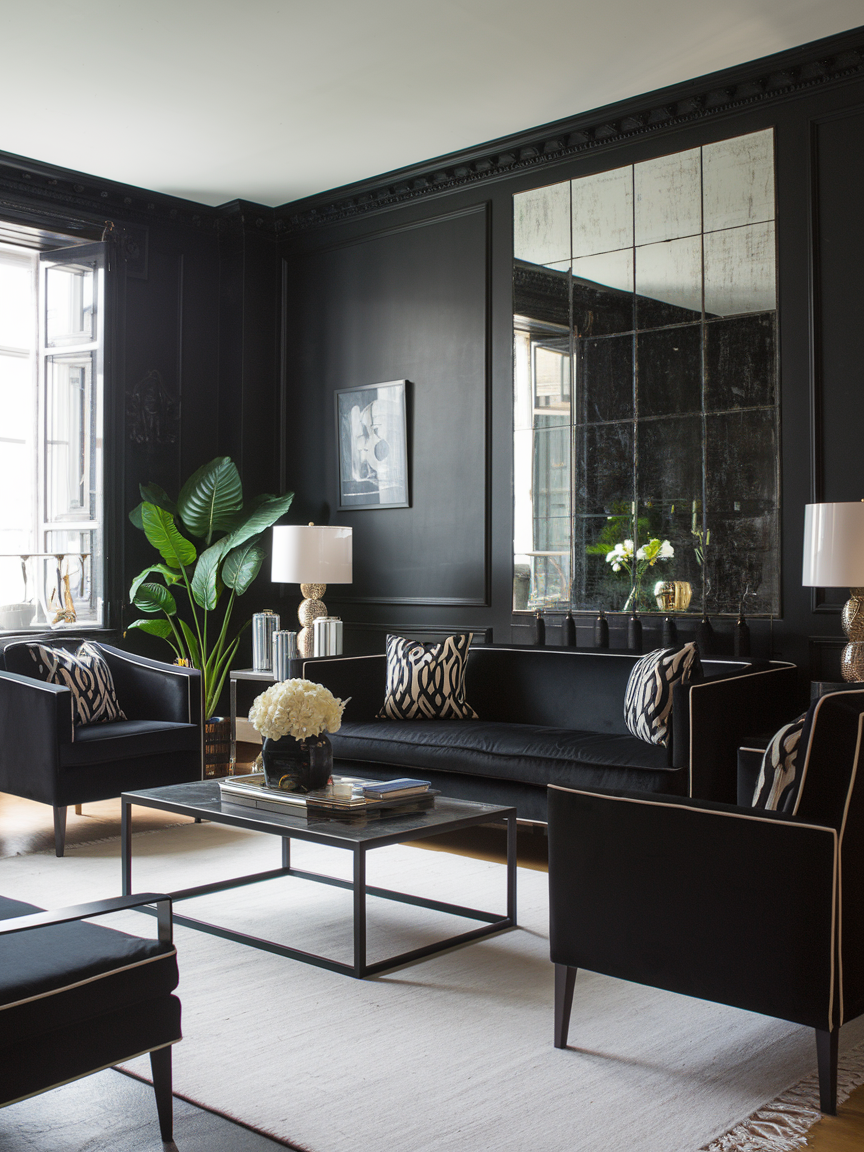
Black might sound risky for a living room, but it can be stunning when done right. It adds depth, drama, and a high-end feel that is hard to match. The trick is to balance it with plenty of light elements—white trim, large mirrors, or light-colored furniture. Black walls can make artwork and décor pop like nothing else. If you want your living room to feel bold, modern, and effortlessly cool, black could be your perfect match.
7. Muted Blush for Soft Romance
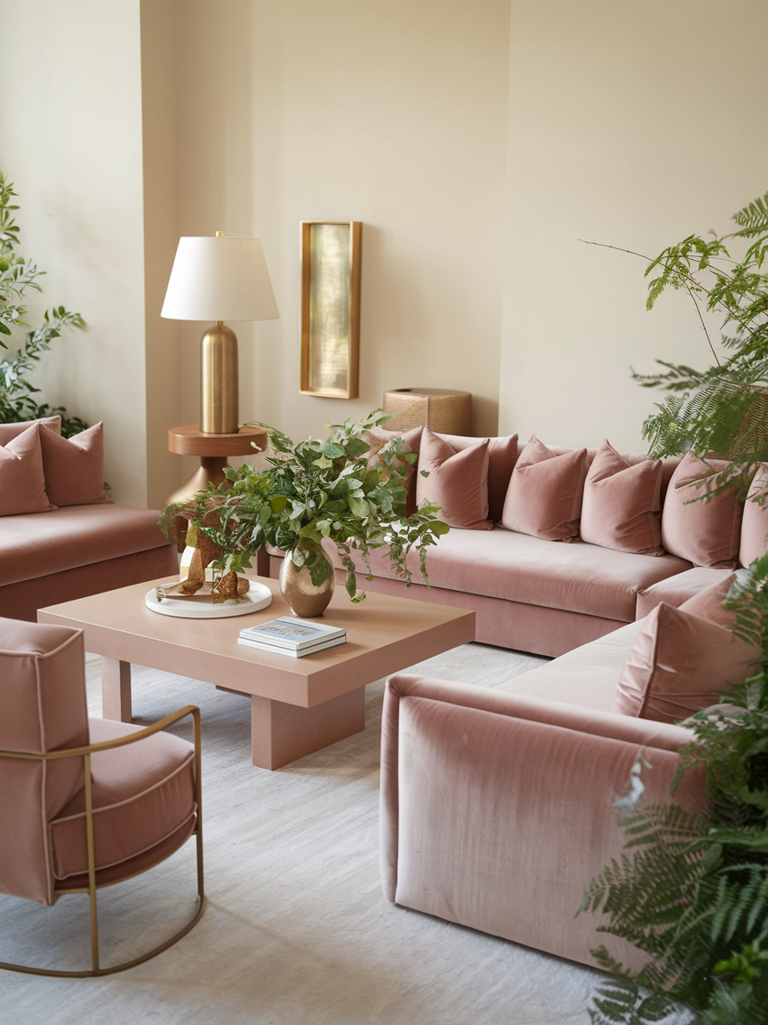
Blush pink doesn’t have to be overly sweet, it can actually feel incredibly sophisticated when you choose a muted tone. This soft, warm hue pairs beautifully with gold accents, cream-colored furniture, and lush greenery. It’s subtle enough that it doesn’t overwhelm the room, yet it still brings a gentle touch of color that feels inviting and personal. Perfect for those who want a hint of warmth without going too bold.
8. Olive Green for Understated Luxury
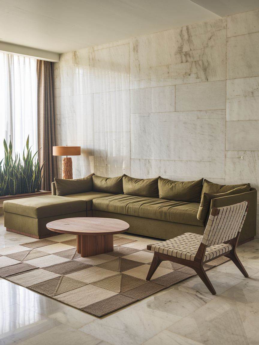
Olive green is rich, elegant, and slightly unexpected—perfect for making your living room feel special. It works beautifully with natural wood tones, leather furniture, and warm metallics like brass. This color creates a grounded, sophisticated atmosphere that still feels cozy. Plus, it’s a versatile shade that works in both modern and traditional spaces, giving you plenty of styling freedom.
9. Burnt Orange for Bold Personality
If you want your living room to have energy and personality, burnt orange is your go-to. It’s warm, vibrant, and instantly draws attention without feeling chaotic. This color works especially well in bohemian, retro, or eclectic spaces. Pair it with natural wood, patterned textiles, and plenty of greenery for a balanced look. It’s the perfect mood-lifter for days when the weather (or your mood) is a little gloomy.
10. Taupe for Timeless Versatility
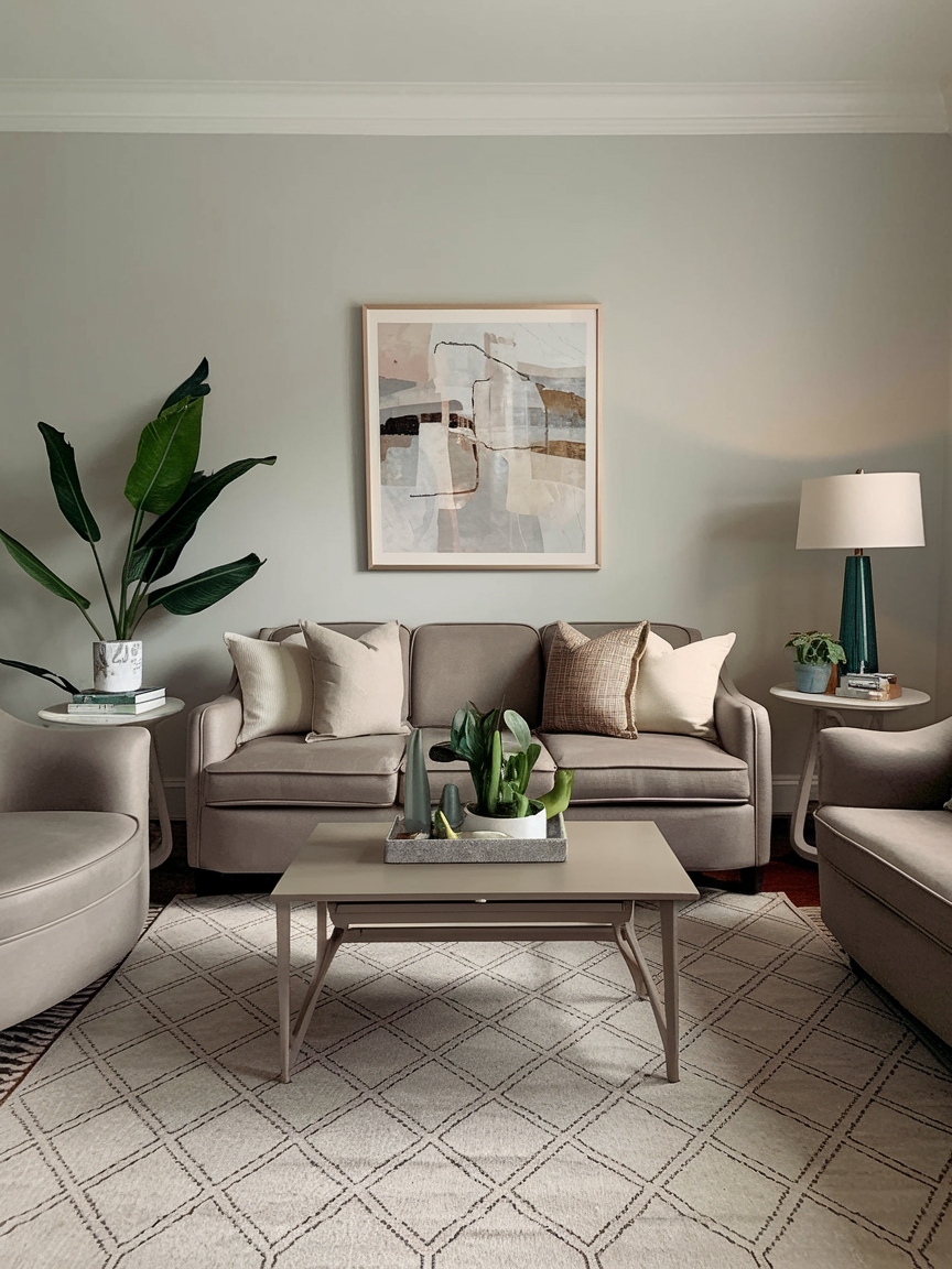
Taupe is one of those colors that never goes out of style. It’s neutral enough to work with just about any décor style, but still has enough depth to add character. The beauty of taupe is that it can lean warm or cool depending on what you pair it with. Use it as a backdrop for bold furniture or keep the whole room neutral for a calming, minimalist vibe.
11. Sky Blue for Breezy Serenity
Sky blue is like a gentle exhale for your living room. It’s light, airy, and makes you feel like you are on a coastal holiday without leaving your sofa. This shade works beautifully with white trim, natural fibers, and pale wood furniture. Add some striped cushions or a jute rug for that relaxed beach-house vibe. It’s also a fantastic choice if you want to visually open up a smaller space because it reflects light and creates an uplifting atmosphere that’s calm but never dull.
12. Mustard Yellow for Retro Energy
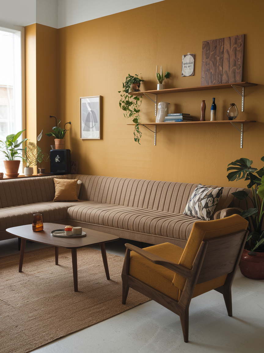
Mustard yellow is a mood booster in paint form. It’s bold enough to make a statement but not so bright that it overwhelms the room. Pair it with warm wood tones, rich greens, or deep blues for a retro-inspired palette that feels both nostalgic and fresh. This color shines in rooms that get plenty of natural light, where it can radiate warmth and energy. It’s perfect if you want your living room to feel sunny and spirited, even on the dreariest days.
13. Soft Lavender for Subtle Elegance
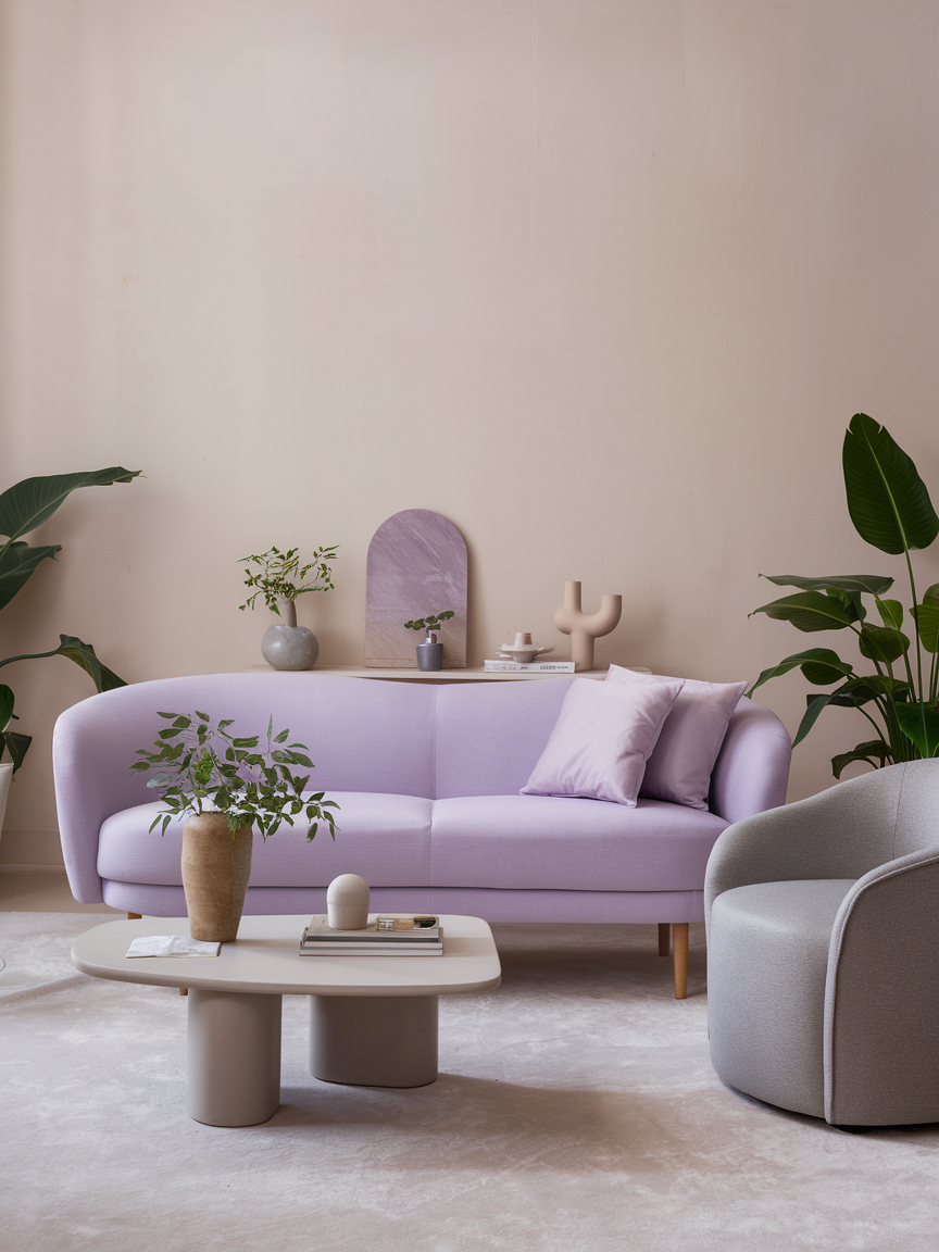
Lavender might not be the first color you think of for a living room, but it can be absolutely stunning in the right setting. This soft, dusty shade adds a touch of elegance without feeling overly feminine. It pairs beautifully with gray, cream, or muted gold accents. If you are aiming for a space that feels restful yet still special, lavender is a great choice. Plus, it adds just enough color to make the room feel thoughtfully designed without being overwhelming.
14. Mocha Brown for Cozy Comfort
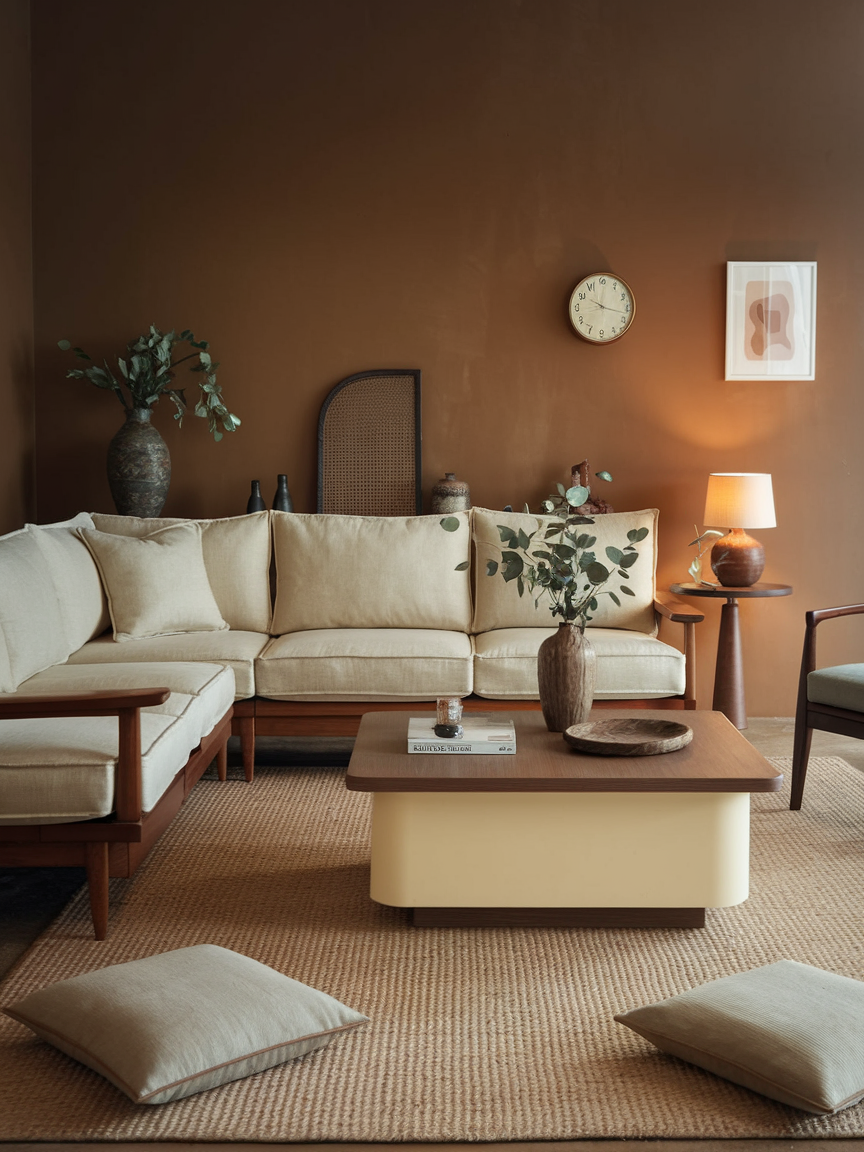
Mocha brown brings warmth and coziness like no other. It creates a grounded atmosphere that feels intimate and inviting, making it ideal for rooms where you love to curl up with a book or binge-watch your favorite series. Pair it with cream or beige accents for a classic look, or add pops of burnt orange or olive green for a richer feel. This color works especially well in rooms with good lighting, as it absorbs light beautifully without making the space feel too dark.
15. Seafoam Green for Fresh Tranquility
Seafoam green has that magical quality of feeling fresh yet calming. It brings to mind soft ocean waves and breezy afternoons, making it perfect for a laid-back living room. Pair it with sandy beige, crisp white, and woven textures to create a light and airy coastal vibe. This shade is especially good at making a space feel rejuvenating and open, so it is great for smaller rooms or spaces that don’t get a ton of natural light.
16. Ruby Red for Dramatic Luxury
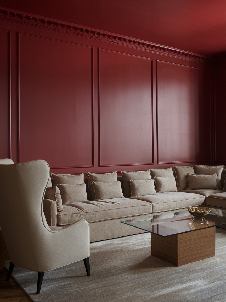
Ruby red is unapologetically bold, rich, and confident. It instantly commands attention and sets a glamorous mood. This color works best when used strategically—maybe as an accent wall paired with cream or gold details, or through plush velvet furniture that becomes the room’s centerpiece. Red is known for sparking conversation and energy, so it is an excellent choice for entertaining spaces. Just make sure to balance it with softer tones to keep the room from feeling overwhelming.
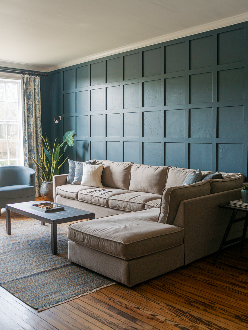
17. Dusty Blue for Relaxed Refinement
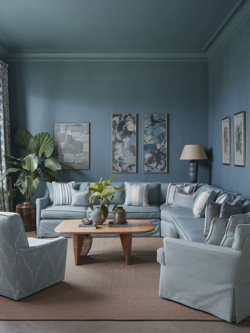
Dusty blue is understated yet sophisticated, striking the perfect balance between calming and stylish. It works well with soft whites, warm wood, and brushed metal finishes. This color feels timeless, so you won’t be itching to repaint every couple of years. It’s a wonderful choice for a living room that you want to feel serene, but still have personality. Add a few textured cushions or an oversized rug to bring in warmth and keep the space feeling comfortable.
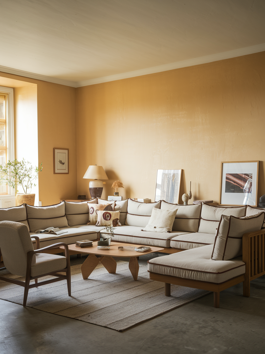
18. Golden Beige for Sun-Kissed Warmth
Golden beige is basically sunshine in paint form. It has that natural warmth that makes any living room feel more inviting. It’s neutral enough to work with various styles but has enough golden undertones to add personality. This shade pairs wonderfully with natural materials like rattan, linen, and oak. You can lean into the earthy vibe with terracotta accents or keep it light and breezy with white and cream furnishings. Either way, it is a color that instantly uplifts the mood.
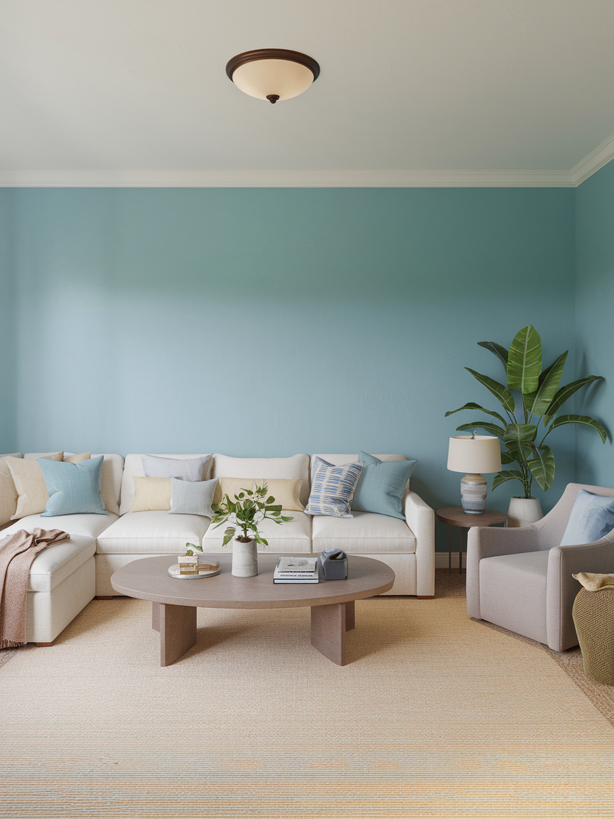
19. Teal for Balanced Boldness
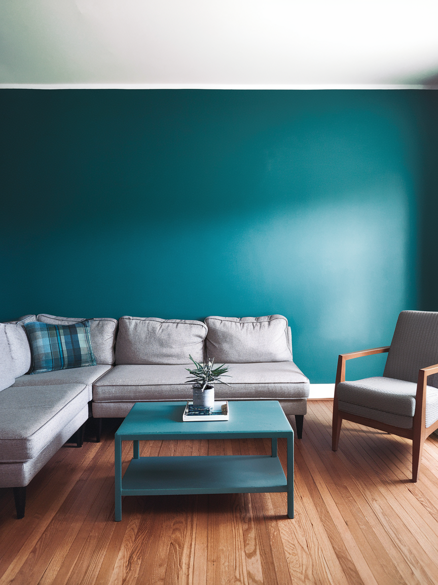
Teal is one of those magical colors that somehow feels bold and calming at the same time. It works beautifully in both modern and traditional spaces, pairing well with gold, copper, and natural wood tones. Use it for an accent wall to make a strong statement or go all-in for a more dramatic look. The depth of teal makes it perfect for creating a cozy yet sophisticated atmosphere where you can unwind without feeling like you are in a dark cave.
20. Soft Mint for Refreshing Lightness
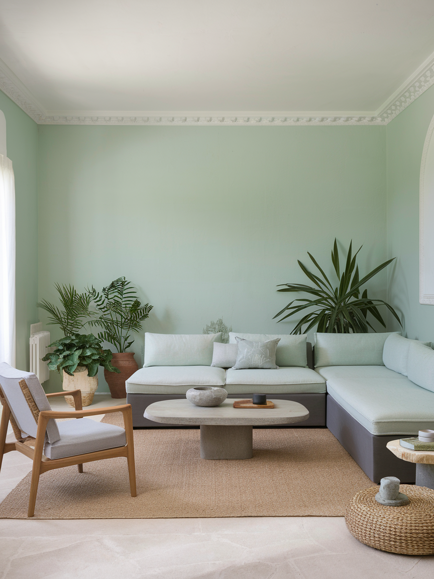
Soft mint is refreshing, cheerful, and perfect for making your living room feel a little more open. It pairs wonderfully with white trim, light woods, and natural fibers, creating a breezy, relaxed vibe. This shade works especially well in spaces that need a little pick-me-up, as it reflects light and feels uplifting. It is subtle enough to keep the atmosphere calm but still brings in a pop of personality that makes the room feel thoughtfully designed.
21. Coral for Cheerful Charm
Coral brings a fun, playful energy into the living room while still feeling chic. It’s warm, vibrant, and instantly brightens the mood of the space. Pair it with crisp white for a fresh look or with navy for a more nautical vibe. Coral works beautifully in rooms that get plenty of light, as it enhances that natural brightness. It’s also a fantastic way to make your living room feel more welcoming for guests without going too over the top.
22. Forest Green for Rich Depth
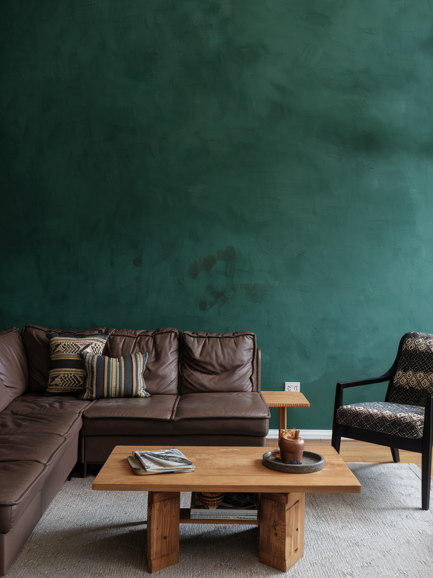
Forest green is lush, sophisticated, and timeless. It brings a sense of nature indoors, creating a serene yet luxurious feel. This color pairs beautifully with warm metals like brass or copper and rich textures like velvet or leather. It works particularly well in larger living rooms where its depth can shine without making the space feel too enclosed. Add some leafy plants to echo the natural vibe, and you will have a room that feels grounded yet glamorous.
23. Pale Peach for Soft Warmth
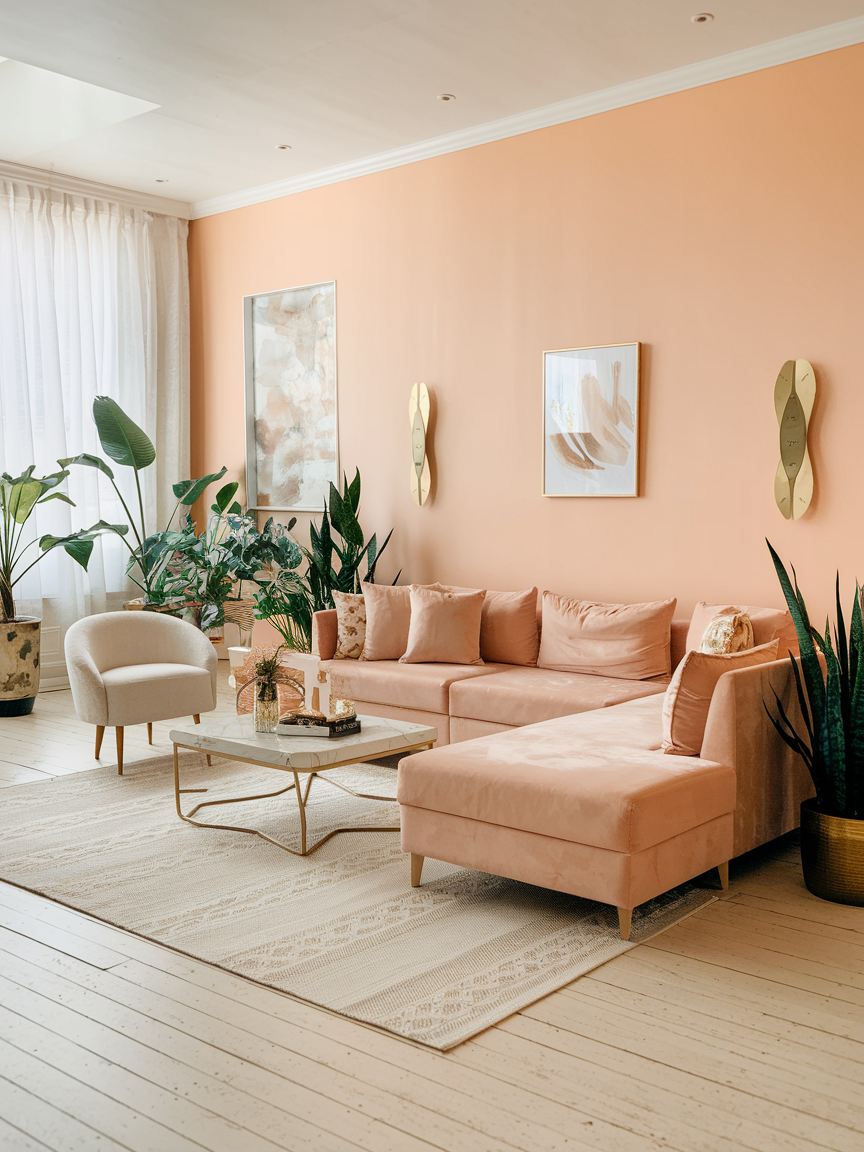
Pale peach is gentle, uplifting, and just a little unexpected. It’s a lovely choice if you want something warmer than white but softer than pink. This color works especially well in sunny living rooms, where the natural light makes it glow. Pair it with light wood, cream, and a few gold accents for a soft, dreamy atmosphere. It is perfect for creating a living room that feels bright and welcoming without being too intense.
24. Slate Blue for Modern Calm
Slate blue is cool, modern, and versatile. It works beautifully with both warm and cool accents, making it easy to style over time. This shade feels grounded and sophisticated, perfect for creating a calm environment where you can unwind after a long day. Pair it with light gray, soft white, or even mustard yellow for contrast. It is an especially good option if you want a color that feels stylish but will not go out of fashion any time soon.
25. Warm Cream for Classic Comfort
Warm cream is like a hug in color form. It makes your living room feel cozy and inviting without straying too far from a neutral palette. This shade pairs beautifully with just about any accent color, making it one of the most flexible options you can choose. Add layers of texture with blankets, cushions, and rugs to make the space feel even more comfortable. It’s the kind of color that will always feel timeless and never make you regret your choice.
* Your living room is the heart of your home, and the colors you choose play a huge role in shaping its mood and character. Let these color inspirations guide you toward creating a living room that reflects not just style, but also the perfect mood for every moment.