Choosing the right colors can completely transform your living room, turning an ordinary space into a beautiful and inviting place to relax, entertain, and spend time with loved ones. Color influences the mood of a room, making it feel calm and soothing, bright and cheerful, or bold and sophisticated. From timeless neutrals and earthy tones to refreshing greens, soft blues, and vibrant accent shades, the right palette can bring new life to your home while reflecting your personal style.
Creating a harmonious living room color scheme involves more than simply choosing your favorite shades. Wall colors, furniture, rugs, curtains, artwork, and decorative accessories all work together to establish the room’s overall atmosphere. Warm neutrals can add coziness, cool tones can create a sense of calm, and contrasting colors can introduce depth and visual interest. Thoughtful combinations of paint colors, natural materials, layered textures, and lighting can help your living room feel balanced, stylish, and comfortable throughout the day.
Let’s explore these inspiring color combinations and find fresh ideas to transform your living room into a welcoming, stylish space you’ll love spending time in!
1. Slate Blue for Modern Calm
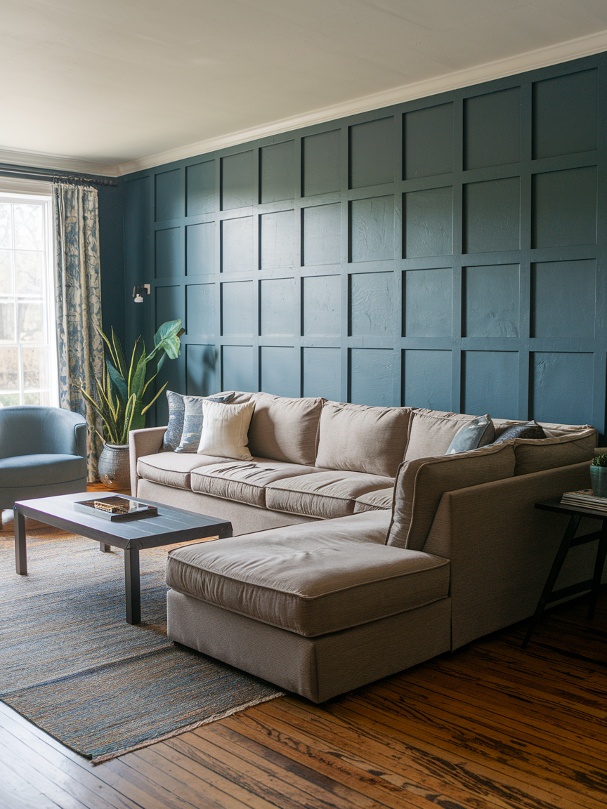
Slate blue provides a sophisticated balance between cool blue tones and subtle gray undertones, making it an excellent choice for a modern living room. Its muted appearance creates a calm backdrop that works beautifully with light gray furniture, white trim, warm wood, and brushed metal finishes. For a more dynamic palette, introduce mustard yellow cushions or rust-colored accessories to provide contrast against the cooler walls. Slate blue is versatile enough to complement contemporary furniture, classic decorative pieces, and minimalist interiors. It also works well as an accent color if you want to add depth without repainting the entire room. Layering different textures through soft rugs, linen curtains, and upholstered furniture prevents the space from feeling flat. With its understated elegance and easy adaptability, slate blue creates a living room that feels polished, peaceful, and comfortably modern.
2. Warm Cream for Classic Comfort
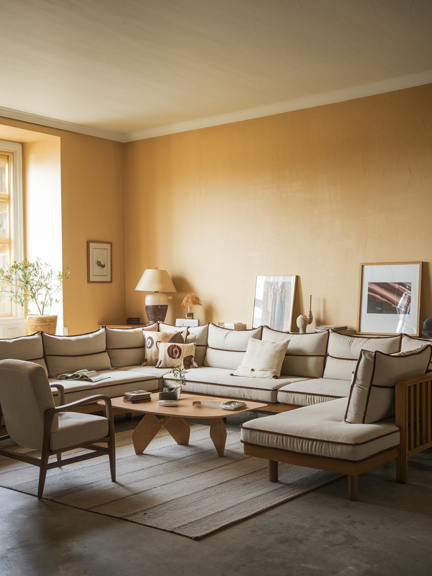
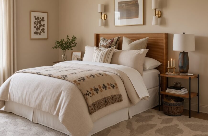
Warm cream creates a timeless living room atmosphere that feels soft, welcoming, and effortlessly elegant. Unlike cooler whites, cream has subtle yellow or beige undertones that bring additional warmth to walls and furnishings. This makes it particularly suitable for interiors featuring natural wood, traditional furniture, vintage accessories, and layered neutral textiles. Pair cream walls with beige sofas, oak coffee tables, woven rugs, and linen curtains to create a harmonious foundation. You can also introduce deeper accents such as olive green, navy, or chocolate brown for additional contrast. To prevent the room from looking too uniform, combine different materials and textures, including boucle upholstery, knitted throws, and natural woven baskets. Warm cream offers exceptional decorating flexibility, allowing you to change accessories and accent colors over time while maintaining a comfortable and beautifully coordinated living room.
3. Classic Black for Chic Drama
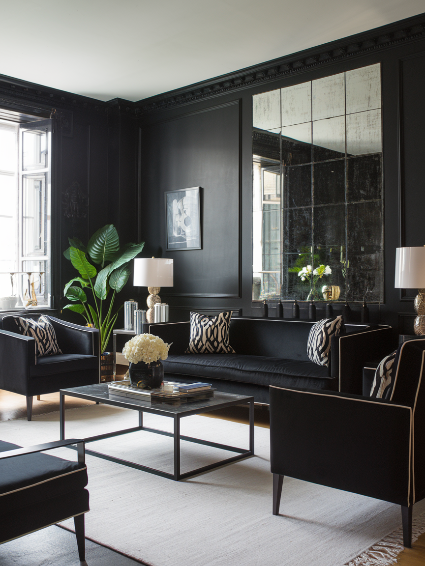
Classic black creates a bold, sophisticated atmosphere that gives a living room a distinctive modern edge. Although it is a darker choice, black can make architectural details, artwork, and decorative objects stand out beautifully. The key is to balance its intensity with lighter colors and carefully planned lighting. Pair black walls with cream furniture, pale wooden floors, large mirrors, or white decorative accents to create contrast and visual depth. For a less dramatic approach, introduce black through an accent wall, built-in shelving, or statement furniture. Textured materials such as velvet, leather, and natural wood can soften the overall appearance while adding richness. Black works particularly well in contemporary, industrial, and modern minimalist interiors, creating a living room that feels confident, refined, and visually striking.
4. Muted Blush for Soft Romance
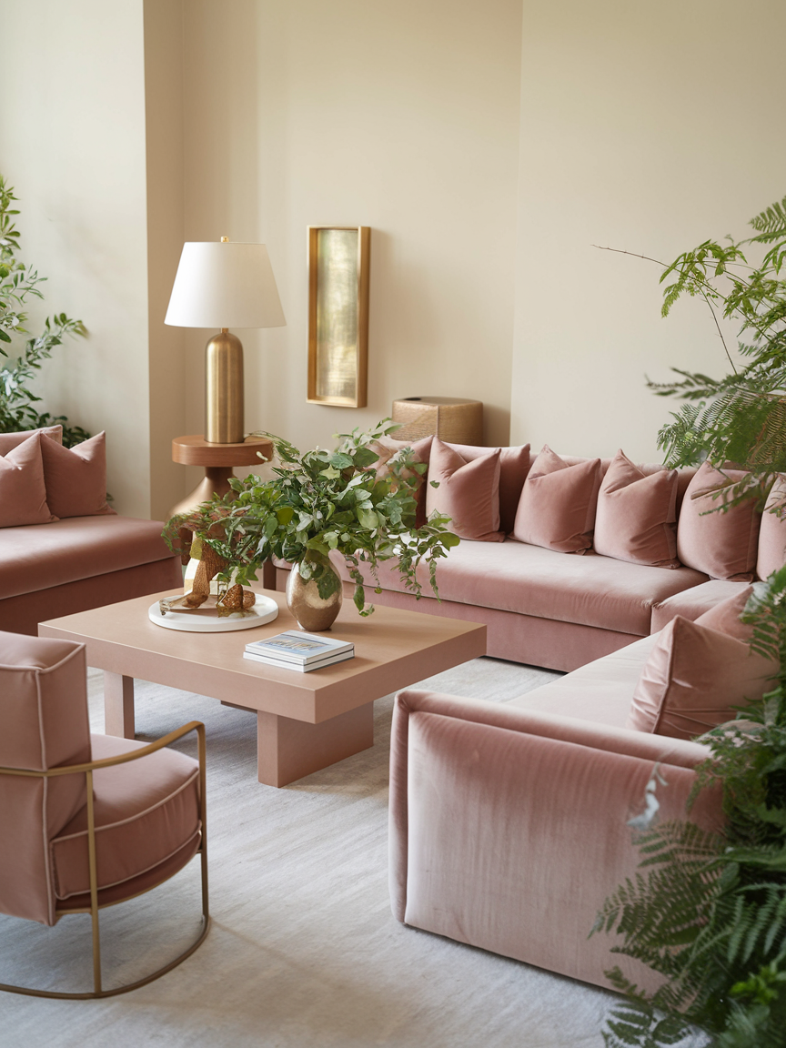
Muted blush pink introduces a gentle warmth that makes a living room feel elegant without becoming overly sweet. Unlike brighter pinks, dusty blush shades have a subtle sophistication that works beautifully with neutral furnishings and natural textures. Pair blush walls with ivory sofas, light wooden tables, brushed brass accessories, and soft gray accents for a balanced palette. A few green plants can provide a refreshing contrast while preventing the room from feeling too delicate. If you prefer a more understated look, use blush pink for an accent chair, decorative cushions, or curtains instead of painting every wall. This versatile color suits romantic, contemporary, and Scandinavian-inspired interiors, bringing a soft glow to the space while maintaining a polished appearance. It is a lovely option for anyone who wants a living room that feels warm, graceful, and inviting.
5. Olive Green for Understated Luxury
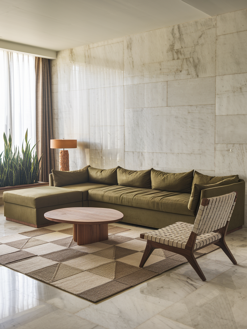
Olive green offers a rich, earthy alternative to traditional neutral colors. Its muted golden-green undertones create a grounded atmosphere that feels sophisticated without appearing overly formal. This shade pairs especially well with walnut furniture, caramel leather, cream upholstery, and warm brass finishes. Olive green walls can provide a beautiful backdrop for framed artwork and textured fabrics, while olive-colored furniture adds character to a room with lighter walls. For a nature-inspired interior, incorporate woven accessories, wooden decorative objects, and leafy plants to complement the color’s organic quality. Olive green also adapts easily to different design styles, from traditional interiors to modern spaces with clean lines. Its depth and warmth make it an excellent choice for creating a living room that feels distinctive, comfortable, and timeless.
6. Burnt Orange for Bold Personality
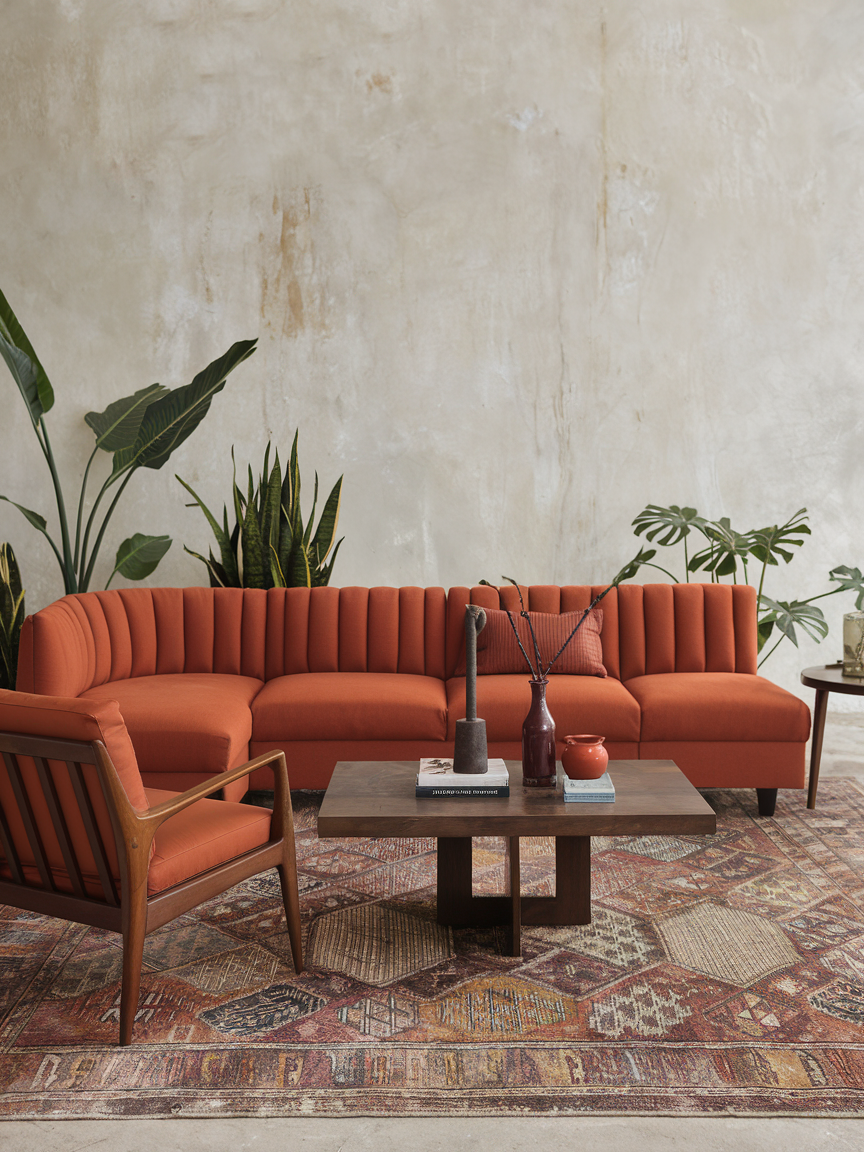
Burnt orange brings vibrant warmth and a sense of individuality to a living room. With its earthy red and orange undertones, this color creates a welcoming atmosphere while adding more personality than a conventional neutral palette. It works particularly well in bohemian, retro, and eclectic interiors, where layered patterns and expressive decorative pieces are encouraged. Pair burnt orange with warm wood, cream textiles, olive green accents, and patterned rugs to create a balanced arrangement. If you prefer a subtle introduction, use the color on a statement armchair, velvet cushions, or decorative pottery. For a more dramatic look, consider a burnt orange feature wall complemented by understated furnishings. This energetic shade can make the living room feel cheerful and inviting while adding richness that works beautifully throughout the seasons.
7. Taupe for Timeless Versatility
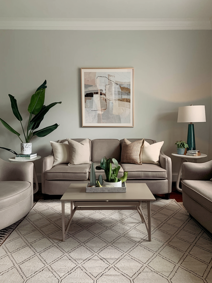
Taupe combines the understated beauty of gray with the warmth of brown, making it an exceptionally versatile living room color. Its balanced appearance creates a sophisticated foundation that works with traditional furniture, contemporary silhouettes, and minimalist accessories alike. Depending on the shade and surrounding finishes, taupe can feel warm and cozy or cool and refined. Pair it with ivory upholstery, natural wood, textured rugs, and soft lighting for a comfortable neutral interior. Alternatively, introduce deeper accents such as navy, forest green, or charcoal to create more contrast. Taupe is particularly effective when several shades of the same color are layered throughout the room, adding dimension without relying on bold patterns. If you want a living room that feels polished today and remains adaptable as your decorating preferences change, taupe is a dependable choice.
8. Soft Beige for Effortless Warmth
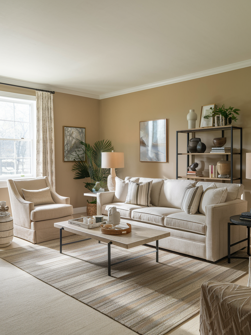
Soft beige is a wonderful choice for creating a living room that feels welcoming, relaxed, and effortlessly stylish. Instead of flat or overly yellow shades, look for beige with creamy or subtle sandy undertones that add depth without overwhelming the space. This versatile neutral works beautifully with wooden furniture, woven accessories, metallic finishes, and vintage decorative pieces. To make the room feel even more inviting, layer different textures through linen cushions, knitted throws, and a natural fiber rug. Beige walls also help distribute natural light throughout the room, making the space feel brighter and more open. Whether your interior leans toward modern minimalism or classic elegance, this timeless color provides a beautiful foundation for a comfortable living room.
9. Deep Navy for Sophisticated Drama
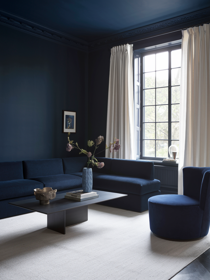
Deep navy brings richness and sophistication to a living room, creating an atmosphere that feels both dramatic and comfortable. Its deep blue undertones provide a striking backdrop for contrasting details such as crisp white trim, brass accessories, and cream-colored upholstery. Navy walls can make a large living room feel more intimate, while a single accent wall introduces depth without completely changing the character of the space. Balance this darker shade with warm wooden furniture, soft lighting, and textured fabrics to prevent the room from feeling too heavy. Navy also pairs beautifully with patterned cushions and carefully chosen artwork, allowing decorative details to stand out. The result is an elegant living room with a luxurious appearance that remains inviting enough for everyday relaxation.
10. Sage Green for Natural Calm
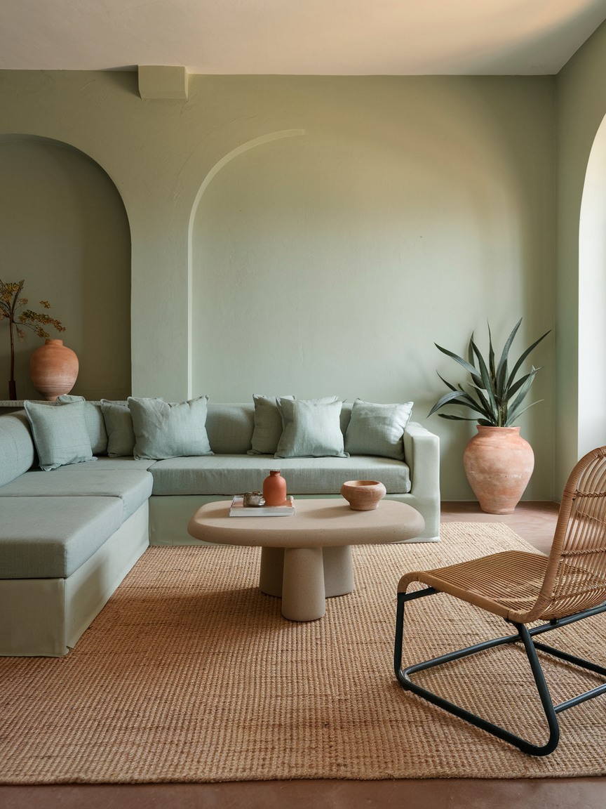
Sage green brings a peaceful, nature-inspired atmosphere into the living room. Its muted green tones create a subtle connection to the outdoors without feeling overly colorful or demanding. This versatile shade pairs beautifully with natural materials such as oak, jute, rattan, and linen, making it ideal for interiors that emphasize comfort and organic textures. Consider sage green walls alongside cream sofas, wooden coffee tables, and a few leafy houseplants to create a balanced, harmonious setting. For a more understated approach, introduce the color through an accent chair, decorative cushions, or curtains. Sage green works equally well in contemporary and traditional interiors because it feels fresh without sacrificing timeless appeal. It is an excellent choice for creating a living room that encourages relaxation and everyday comfort.
11. Warm Terracotta for Earthy Charm
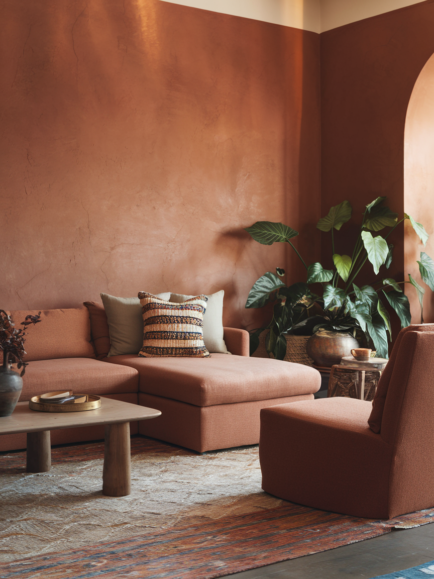
Warm terracotta adds depth, personality, and an earthy richness to living room interiors. Inspired by sun-baked clay and Mediterranean architecture, this inviting shade creates a cozy atmosphere that feels particularly beautiful when paired with natural materials. Combine terracotta walls with cream upholstery, dark wooden furniture, woven baskets, and textured rugs for a relaxed, layered appearance. If painting the entire room feels too bold, consider using terracotta on a feature wall or introducing it through cushions, ceramic vases, and decorative artwork. The reddish-orange undertones bring warmth to neutral interiors while complementing bohemian, rustic, and contemporary styles. Terracotta also works throughout the year, creating a sunlit feeling during cooler months and a natural connection to outdoor landscapes in warmer seasons.
12. Crisp White for Airy Freshness
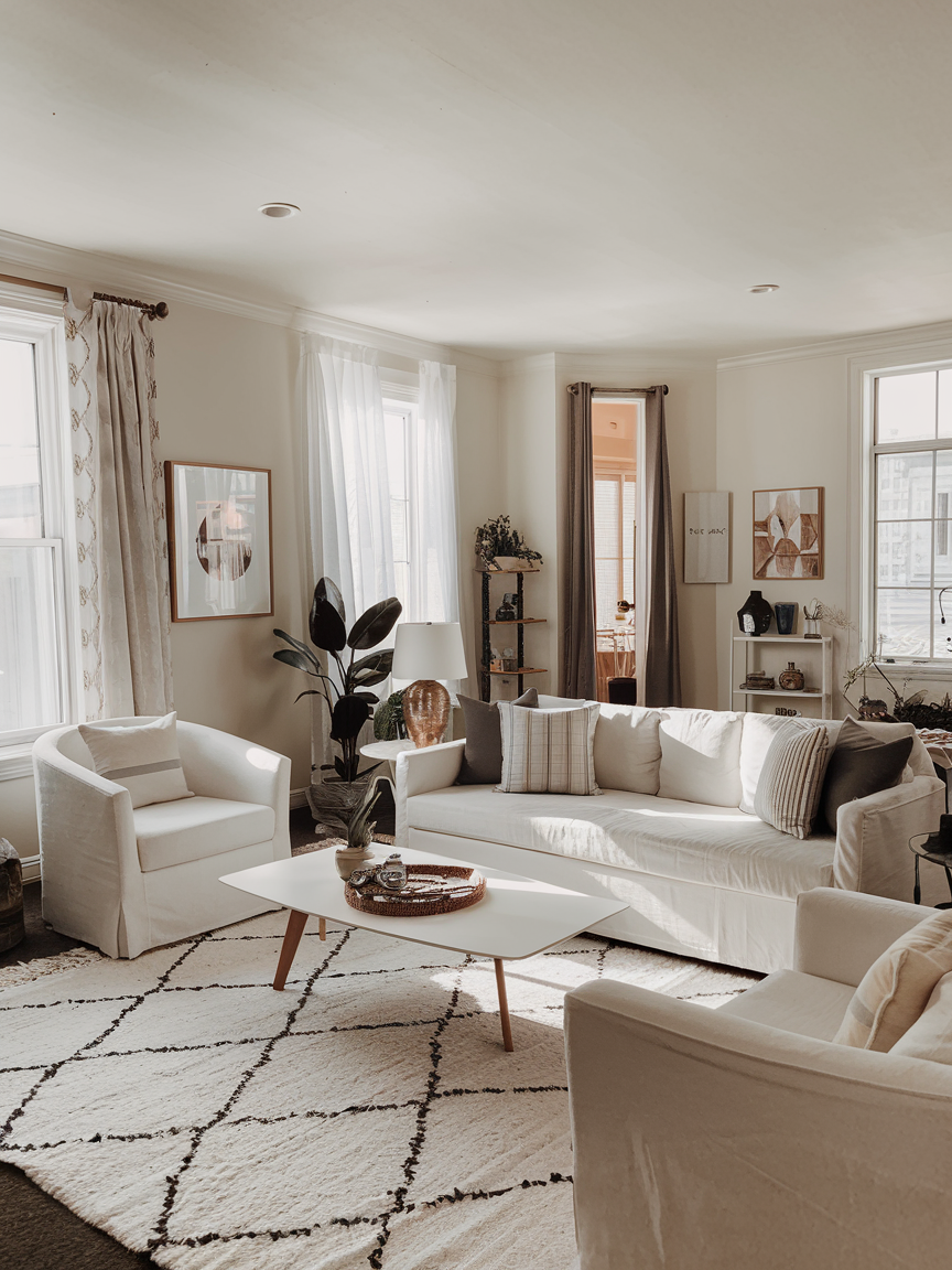
Crisp white walls can make a living room feel clean, spacious, and beautifully refreshed. This classic color provides a versatile backdrop that allows furniture, artwork, and decorative accessories to take center stage. It is particularly useful in smaller rooms or interiors that receive limited natural light, where lighter surfaces can help create a more open appearance. To prevent the space from feeling cold or overly plain, incorporate a variety of textures, including soft rugs, linen curtains, wooden furniture, and woven baskets. You can also introduce subtle contrasts through black frames, warm metallic accents, or colorful cushions. One of the greatest advantages of white is its flexibility, allowing you to experiment with different decorating styles without repainting the walls. With thoughtful layering, a white living room can feel sophisticated, comfortable, and full of character.
13. Sky Blue for Breezy Serenity

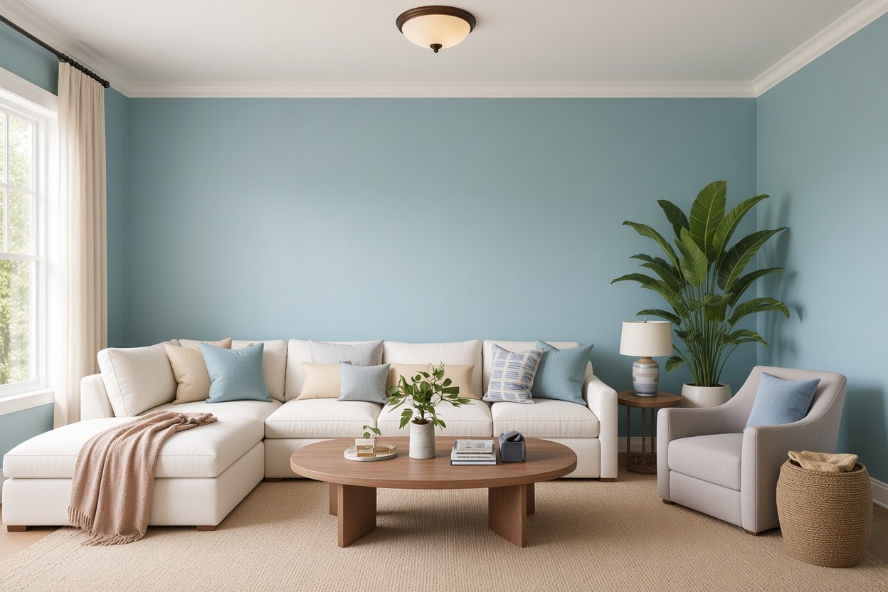
Sky blue brings a light, refreshing quality to the living room, creating an atmosphere reminiscent of clear skies and peaceful coastal settings. Its gentle appearance makes it particularly suitable for interiors that prioritize openness, natural light, and everyday comfort. Pair sky blue walls with white trim, pale oak furniture, natural fiber rugs, and lightweight curtains to create an airy environment. Striped cushions, woven baskets, and subtle nautical-inspired accessories can reinforce the relaxed coastal feeling without making the room look overly themed. In smaller living rooms, a pale blue shade can help maintain a bright, open appearance, especially when combined with light-colored furnishings. You can also introduce sky blue through an upholstered sofa or decorative accessories if you prefer neutral walls. The result is a calm, uplifting living room that feels fresh and effortlessly welcoming.
14. Mustard Yellow for Retro Energy
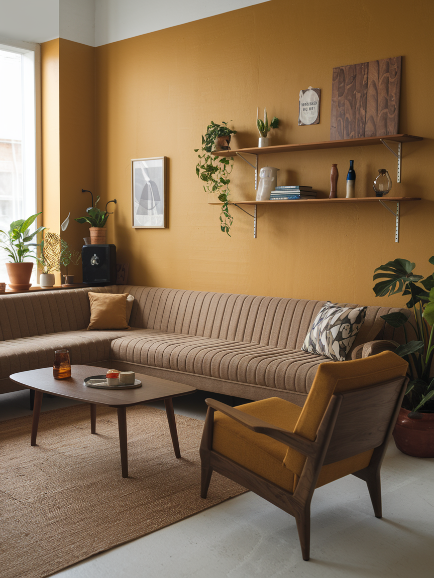
Mustard yellow adds a cheerful burst of color while maintaining the warmth and depth needed for a sophisticated living room. Its golden undertones give it a vintage-inspired character that works beautifully with mid-century modern furniture, rich wood finishes, and earthy decorative accents. Pair mustard yellow with deep blue, olive green, warm brown, or creamy white to create a balanced and visually interesting palette. A mustard accent chair or sofa can become a striking focal point, while cushions and artwork offer a more subtle way to introduce the shade. This color looks particularly appealing when natural light highlights its golden qualities. To prevent it from overwhelming the space, combine it with quieter neutrals and simple furnishings. Mustard yellow is an excellent choice for a living room that feels lively, expressive, and full of personality.
15. Soft Lavender for Subtle Elegance
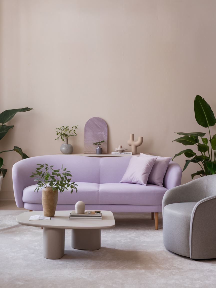
Soft lavender brings an unexpected touch of elegance to a living room while maintaining a gentle, relaxing atmosphere. Muted lavender shades with gray undertones are especially versatile because they introduce color without appearing overly bright. Pair lavender walls with cream upholstery, pale gray accents, light wooden furniture, and understated metallic details for a harmonious appearance. For a more contemporary look, combine lavender with charcoal or deeper plum accents to create contrast. If you prefer to keep the walls neutral, introduce the color through cushions, curtains, artwork, or an upholstered accent chair. Soft lavender works beautifully in interiors that emphasize tranquility, delicate colors, and refined decorative details. Its subtle character makes it an appealing alternative to traditional beige or gray, giving your living room a distinctive appearance while preserving a peaceful and welcoming mood.
16. Mocha Brown for Cozy Comfort
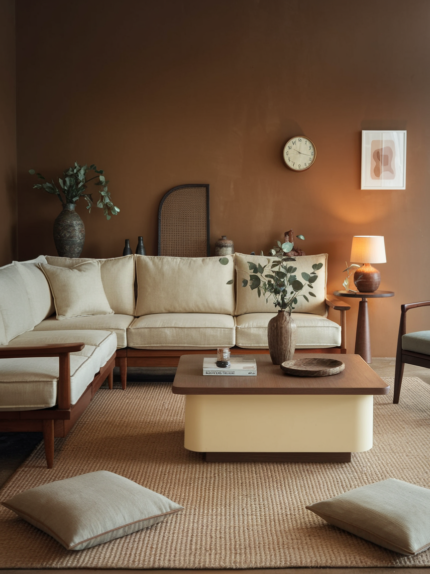
Mocha brown creates a rich, comforting atmosphere that makes the living room feel intimate and grounded. Inspired by coffee, chocolate, and natural wood, this deep neutral brings warmth and sophistication to a variety of interior styles. Pair mocha walls with cream sofas, beige rugs, and light wooden furniture to prevent the space from feeling too dark. For a richer palette, incorporate caramel leather, burnt orange cushions, or olive green accessories. Layered textures are particularly important with deeper brown shades, so consider velvet upholstery, knitted throws, woven baskets, and softly patterned textiles. Good lighting can further enhance the color’s depth while highlighting architectural features and decorative objects. Whether used on the walls or introduced through furniture, mocha brown creates a welcoming environment that feels especially suited to quiet evenings, relaxed conversations, and comfortable everyday living.
17. Seafoam Green for Fresh Tranquility
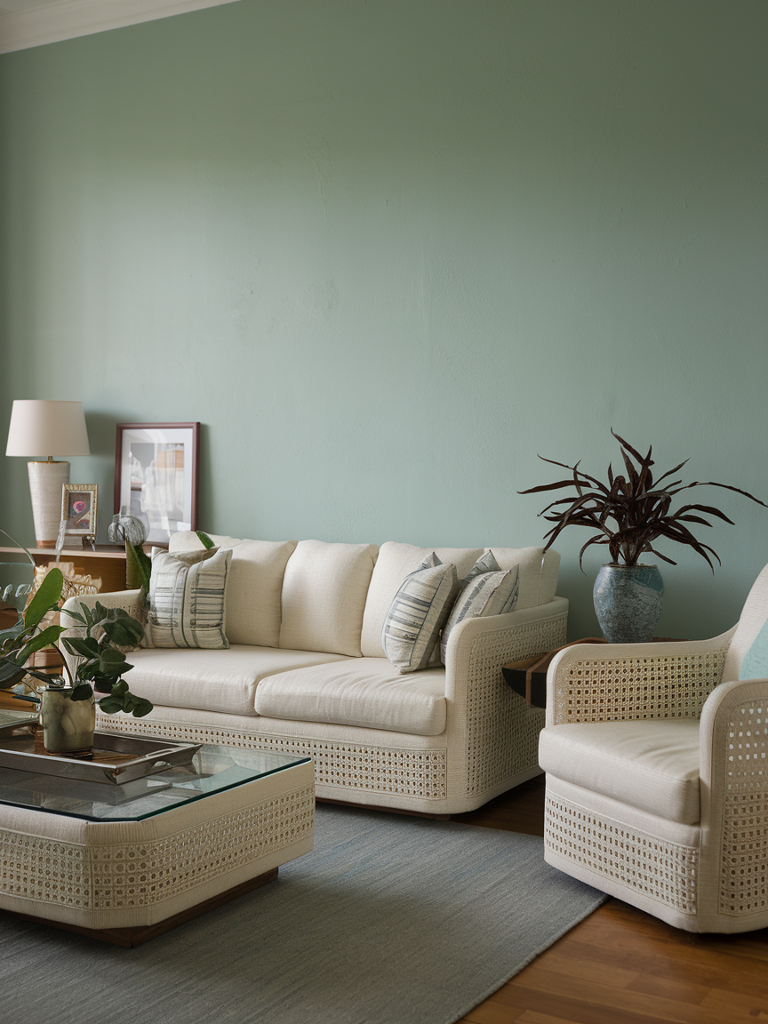
Seafoam green blends delicate green and blue undertones to create a refreshing, peaceful living room palette. Its light appearance brings a subtle coastal influence into the home without requiring obvious beach-themed decorations. Combine seafoam walls with white trim, sandy beige fabrics, pale wooden furniture, and natural woven accessories for a soft, breezy atmosphere. Cream-colored upholstery can help maintain a warm balance, while glass accents and leafy plants add further visual interest. This shade is especially appealing in smaller living rooms because its gentle quality helps the space feel light and open. You can also use seafoam green on an accent wall or through decorative accessories if you want to preserve a neutral backdrop. The result is a relaxed, rejuvenating interior that feels fresh, harmonious, and easy to live in.
18. Coral for Cheerful Charm
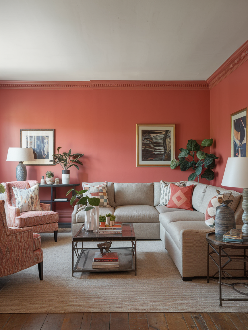
Coral brings lively color and welcoming energy to a living room, combining warm pink and orange undertones in a cheerful, expressive shade. It is a wonderful option for interiors that need a little more personality without moving toward extremely bold colors. Pair coral with crisp white, sandy beige, or light wood for a bright and relaxed atmosphere. For a stronger contrast, combine it with navy blue or deep teal to create a more dramatic palette. Coral cushions, artwork, accent chairs, and decorative ceramics offer easy ways to introduce the color without committing to painted walls. In rooms with plenty of natural light, coral can appear especially vibrant and inviting. Balance it with neutral furnishings and a few natural textures to keep the overall design harmonious. This playful color is ideal for creating a living room that feels friendly, fresh, and full of life.
19. Forest Green for Rich Depth
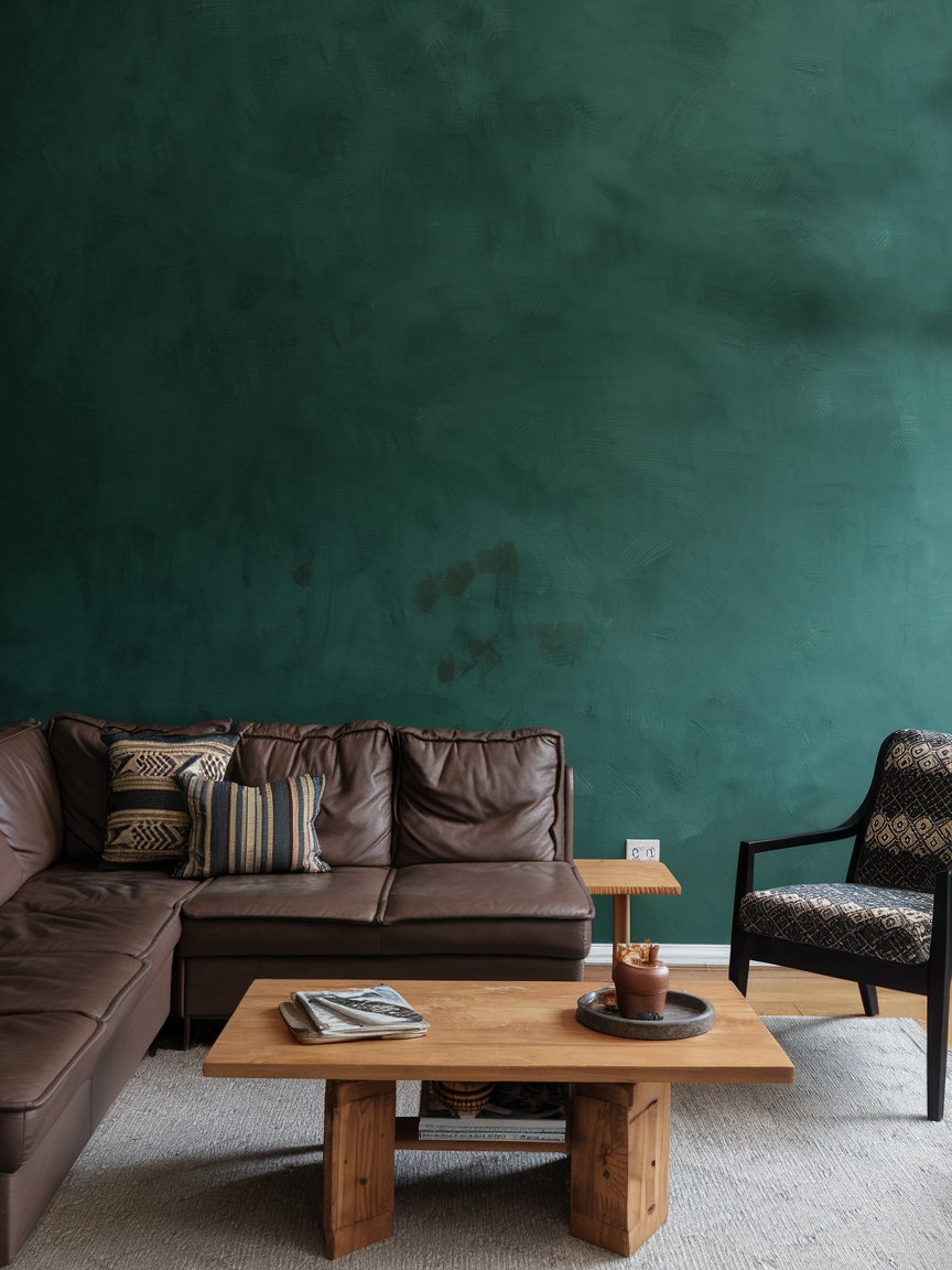
Forest green brings the richness of nature into the living room while creating an atmosphere that feels sophisticated and timeless. Its deep green tones work beautifully with walnut furniture, cream upholstery, brass accents, and luxurious materials such as velvet and leather. For a dramatic interior, paint the walls forest green and balance them with lighter textiles and warm lighting. If you prefer a more subtle approach, introduce the shade through a sofa, accent chair, curtains, or decorative cushions. Wooden furniture and botanical artwork reinforce the connection to nature, while metallic accessories add a touch of elegance. Forest green is particularly effective when layered with different shades of green and natural brown tones. The result is a living room that feels grounded, comfortable, and refined, making it an excellent choice for both traditional and contemporary homes.
20. Pale Peach for Soft Warmth
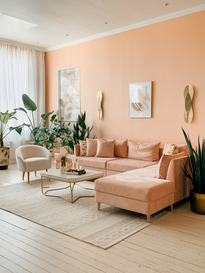
Pale peach offers a gentle alternative to white and beige, introducing a delicate warmth that makes the living room feel bright and welcoming. Its soft pink-orange undertones create a subtle glow, particularly when natural daylight enters the room. Pair pale peach walls with ivory upholstery, light oak furniture, cream curtains, and understated gold accents for a harmonious appearance. Muted sage green and warm taupe also complement peach beautifully, adding contrast without disrupting the softness of the palette. For a more understated look, use peach through cushions, decorative pottery, or artwork against neutral walls. This versatile color works well in contemporary, romantic, and Scandinavian-inspired interiors. When combined with simple furniture and tactile fabrics, pale peach creates a relaxed atmosphere that feels fresh, warm, and quietly elegant.
21. Ruby Red for Dramatic Luxury
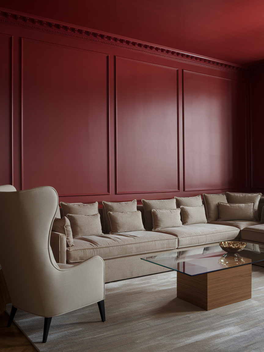
Ruby red introduces bold color and glamorous character into the living room. Its deep, jewel-like appearance creates a striking focal point that works especially well in interiors featuring elegant furniture, rich fabrics, and carefully selected decorative accents. Consider a ruby red velvet sofa, a statement armchair, or a feature wall paired with cream, charcoal, or warm gold details. These complementary colors help balance the intensity of red while emphasizing its luxurious quality. If you prefer a more restrained approach, use ruby red through cushions, artwork, or decorative accessories against a neutral background. Rich textures such as velvet and satin can enhance the color’s depth, while softer lighting creates a more intimate atmosphere. Used thoughtfully, ruby red brings confidence, warmth, and visual drama to a living room without sacrificing comfort.
22. Dusty Blue for Relaxed Refinement
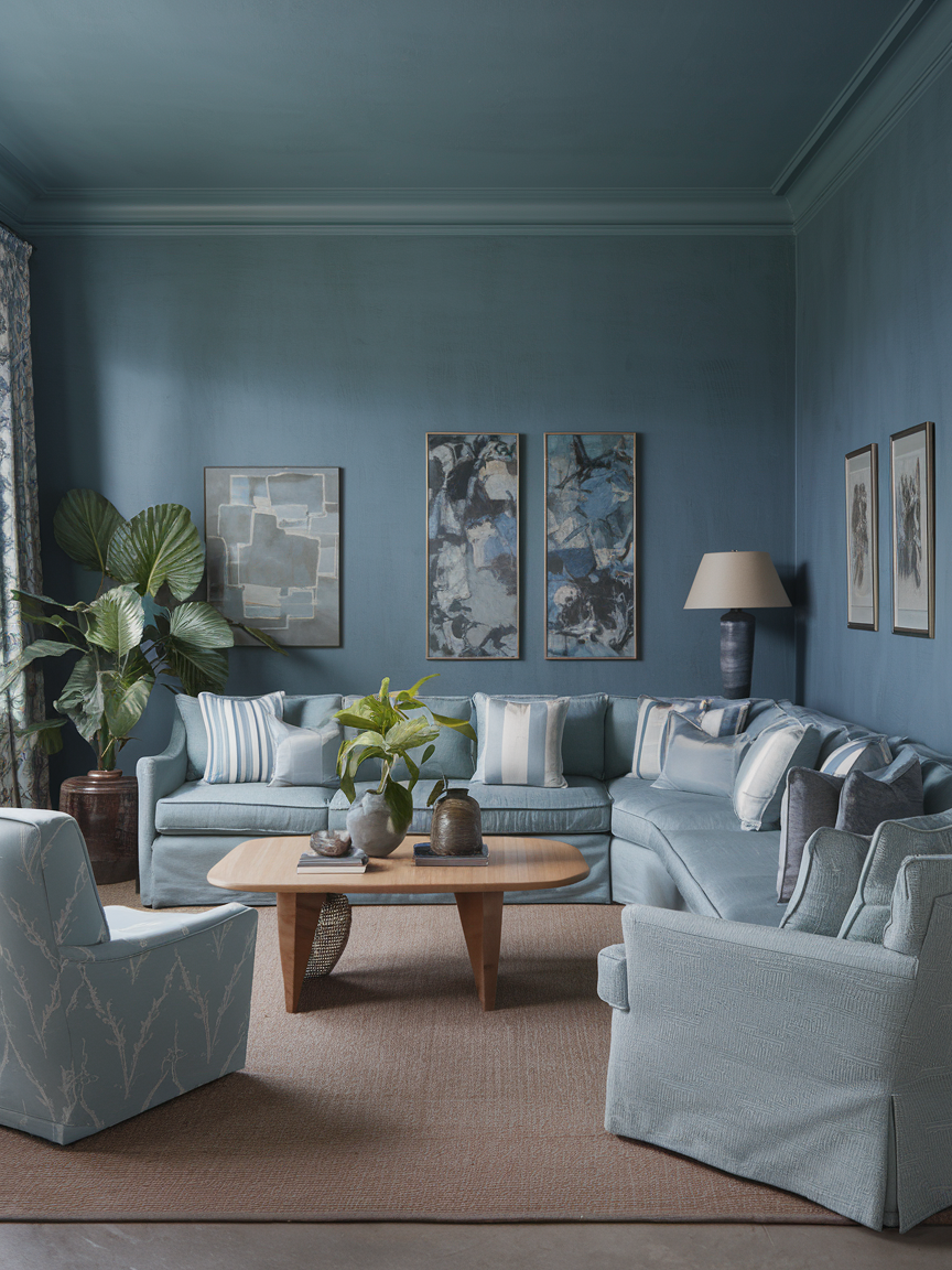
Dusty blue combines the calmness of blue with a muted, slightly gray undertone that gives it a refined and timeless appearance. This understated shade works beautifully in living rooms where comfort and sophistication are equally important. Pair dusty blue walls with warm oak furniture, ivory upholstery, brushed metal accents, and soft neutral textiles to create a balanced environment. For additional depth, introduce navy cushions or charcoal decorative pieces without making the palette feel too dark. Dusty blue also complements traditional furniture, contemporary sofas, and natural materials, making it easy to incorporate into different decorating styles. Textured throws, patterned cushions, and a generously sized rug can add warmth and visual interest. Whether used throughout the room or as an accent color, dusty blue creates a peaceful backdrop that feels elegant, welcoming, and enduring.
23. Golden Beige for Sun-Kissed Warmth
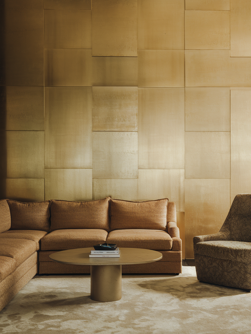
Golden beige brings a subtle sunlit quality to the living room, combining the versatility of a neutral with the richness of warm golden undertones. This shade creates a welcoming backdrop that works particularly well with natural materials and softly layered furnishings. Pair golden beige walls with oak furniture, linen curtains, woven rugs, and cream upholstery to create a bright, comfortable environment. Terracotta accessories and muted green accents can introduce additional depth, while white decorative details keep the palette feeling fresh. Golden beige is also a useful option for rooms that need more warmth without the intensity of yellow or orange. Its gentle coloring works across traditional, contemporary, and rustic interiors, providing flexibility as your decorating style evolves. The overall effect is a living room that feels cheerful, relaxed, and naturally inviting.
24. Teal for Balanced Boldness
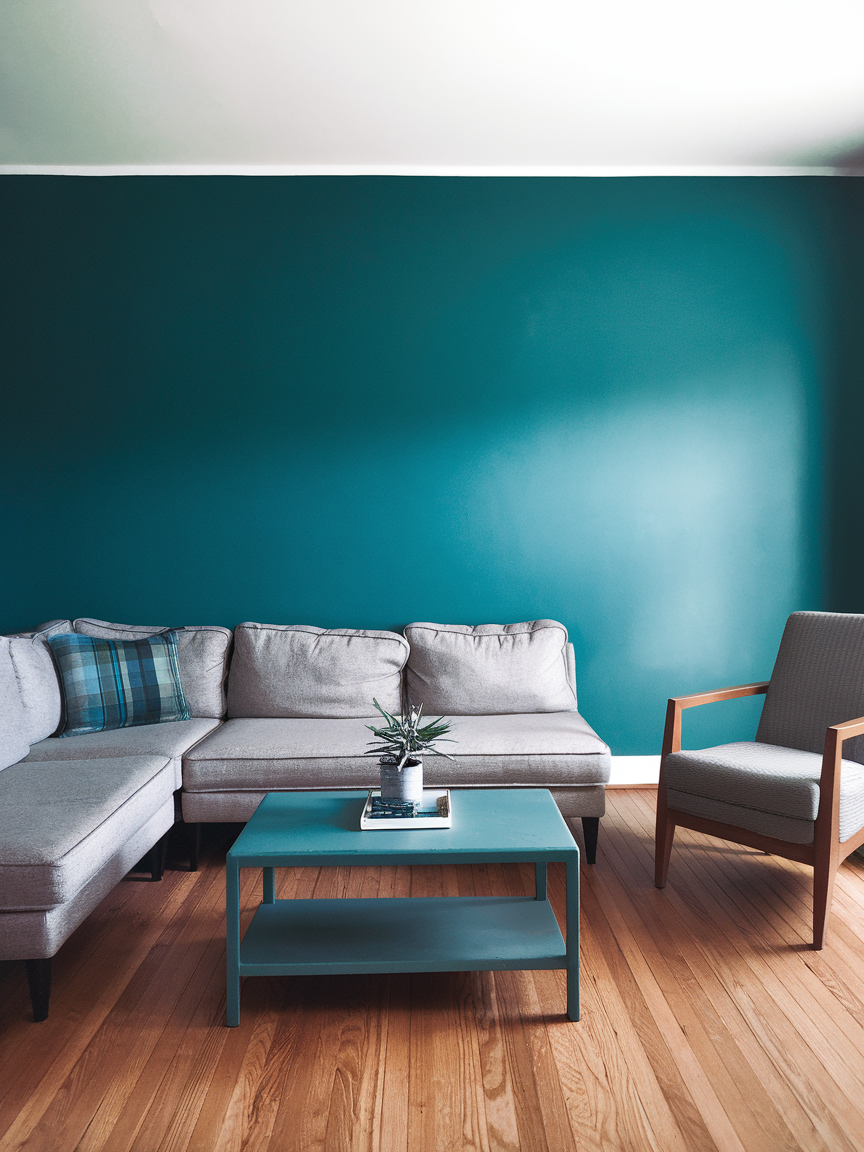
Teal offers a striking combination of blue’s calming qualities and green’s natural richness, making it an appealing choice for a sophisticated living room. Its depth creates a beautiful backdrop for cream furniture, warm wooden finishes, brass accessories, and carefully chosen artwork. Lighter teal shades can feel fresh and contemporary, while deeper versions create a more intimate and dramatic atmosphere. Consider painting an accent wall teal or choosing a teal velvet sofa as the room’s main focal point. To maintain balance, incorporate neutral rugs, soft white textiles, and warm lighting that complement the color without competing with it. Teal also works well with copper, mustard yellow, and natural brown tones, offering plenty of opportunities for creative styling. This versatile shade gives a living room personality while maintaining a comfortable, polished appearance.
25. Soft Mint for Refreshing Lightness
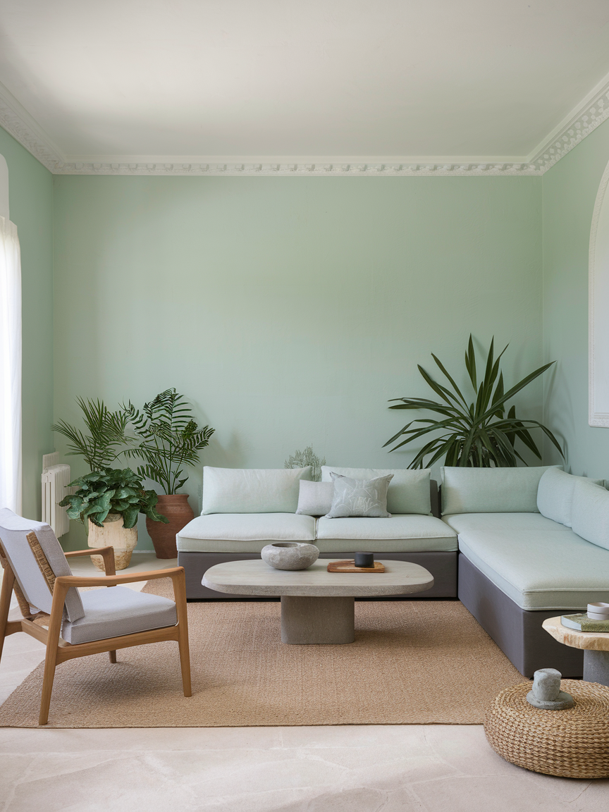
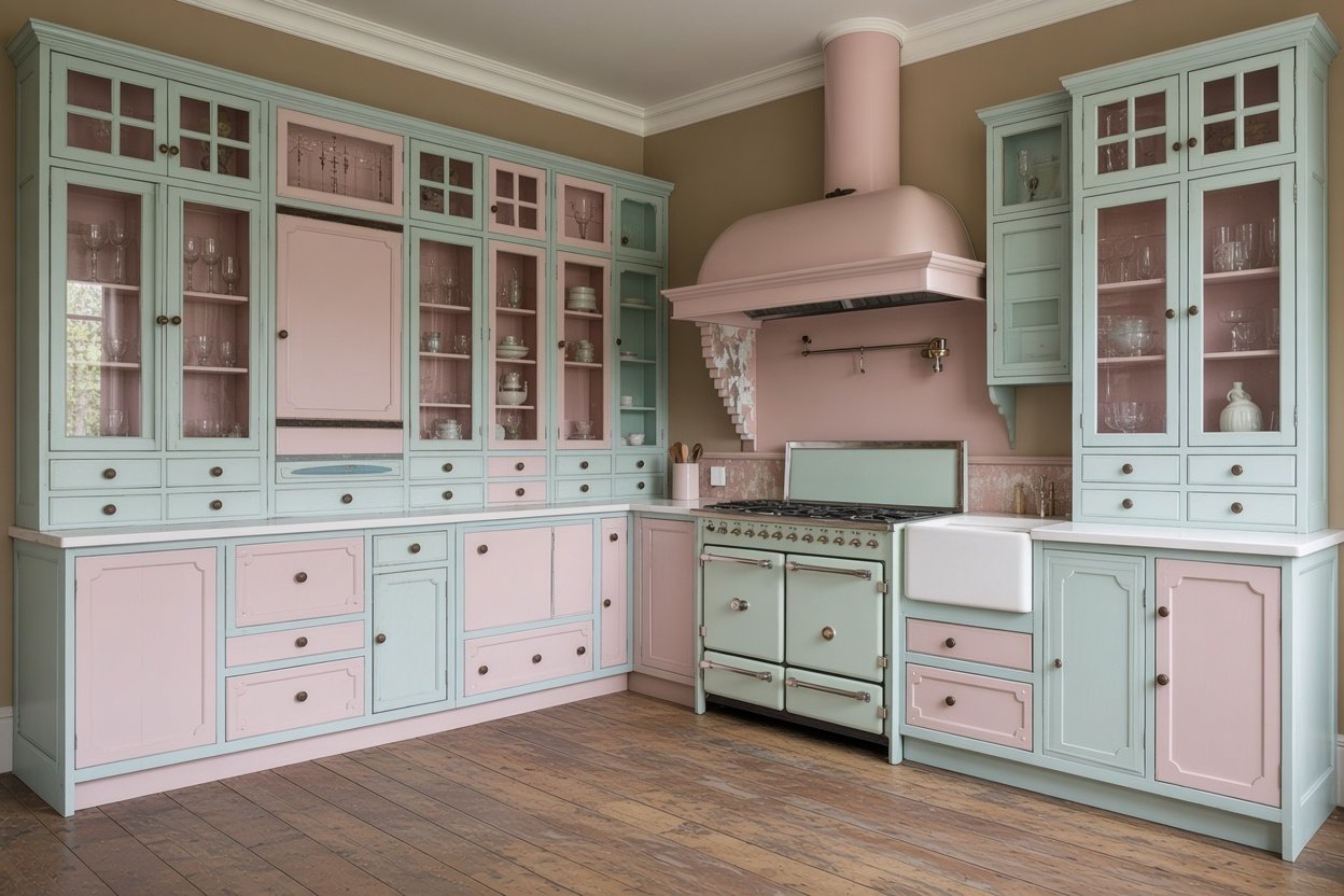
Soft mint brings a fresh, cheerful quality to a living room without overpowering the surrounding décor. Its delicate green undertones create a light and uplifting atmosphere that works particularly well with white walls, pale wood, and natural textures. Pair mint green with cream upholstery, linen curtains, and woven accessories for a relaxed, contemporary appearance. A few touches of blush pink or warm beige can introduce subtle contrast while preserving the palette’s gentle character. If you want to keep the walls neutral, consider a mint accent chair, decorative cushions, or painted side tables instead. This shade is particularly effective in rooms where you want to create a sense of openness and freshness. With its soft color and versatile styling possibilities, mint green can make a living room feel inviting, youthful, and thoughtfully designed.
* The beauty of living room color design lies in the endless opportunities to express your personal style. Use these inspirations to explore colors you love, refresh your favorite decor pieces, and create a living room that feels beautiful, balanced, and welcoming for years to come.